Installation
StatInsight is available for Windows, Linux, and macOS. Choose your platform below.
Windows
Linux
tar -xzf StatInsight.tar.gzchmod +x StatInsight/StatInsight./StatInsight/StatInsight — or double-click the binary in your file manager.macOS
xattr -cr /Applications/StatInsight.appopen /Applications/StatInsight.app. If macOS still shows a warning, right-click the app, choose Open, then confirm.Loading Data
Click Open File on the welcome screen (or Open in the main window) and pick a dataset or a saved project; the Recently Open Files panel reopens the last five with one click. StatInsight detects the type of every column as it loads.
Video tutorial
Supported formats
| Format | Extension | Notes |
|---|---|---|
| CSV | .csv | Delimiter auto-detected (comma, semicolon, pipe, tab) |
| Excel | .xls, .xlsx | Both legacy and modern Excel formats supported |
| RTF | .rtf | Rich Text Format with tabular data |
Variable classification
Each column is automatically classified into one of the following types. You can change the type at any time with the Change to Continuous / Categorical / Label buttons under the variable in the Data Summary tab.
| Type | Description |
|---|---|
| Continuous | Numeric data with many unique values — measurements, weights, lab values |
| Categorical | Limited set of distinct groups — blood type, treatment group, study site |
| Binary | Exactly two distinct values — yes/no, 0/1, male/female |
| Date | Date or time values; common formats auto-recognized |
| Label | High-cardinality text columns (IDs, names) — excluded from statistical analysis |
Saving and reopening projects
Save your entire working session — loaded data, variable types, every result with its figure and post-hoc choice, the Multiple Comparisons selection and the combined figures — as a .stati project file with Save Project. Open it like any other file, or double-click it, to resume where you left off.
Data Summary
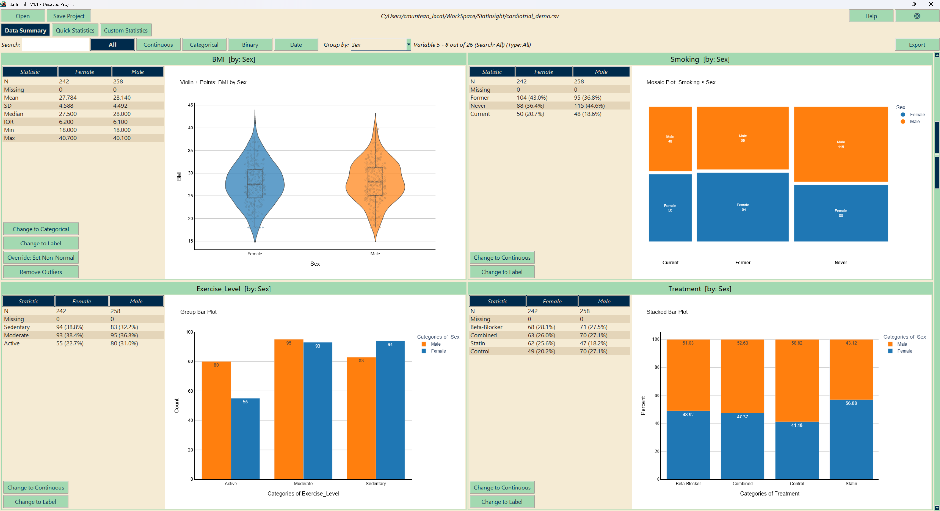
The Data Summary tab provides an at-a-glance summary of every variable in your dataset, four at a time, with a search box and type filters above. Results update instantly when variable types are changed or outliers are removed, and a Group by dropdown splits every statistic and chart by a categorical variable.
Video tutorial
Continuous variables
For numeric variables with many unique values, StatInsight calculates: mean, standard deviation, median, interquartile range (IQR), minimum, maximum, and sample size. A normality assessment is run automatically (composite of Shapiro-Wilk, Anderson-Darling, skewness, and kurtosis) and can be overridden by hand. Each variable is accompanied by a histogram with outliers in a second colour; click it to switch to a violin, ECDF, Q-Q, strip or box plot.
Categorical & binary variables
For categorical and binary columns, StatInsight displays frequency counts and percentages for each group, alongside a bar plot (or a pie, treemap or lollipop chart if you prefer). This allows immediate detection of imbalanced groups or data entry errors.
Date variables
Date columns show the earliest and latest values, total span, and a time-area distribution plot to visualize data collection over time — useful for identifying recruitment gaps or data quality issues.
Outlier removal
Outliers are identified using the IQR method: a value is flagged as an outlier if it falls below Q1 − 1.5 × IQR or above Q3 + 1.5 × IQR. An Remove Outliers button is available for each continuous variable, allowing targeted removal without affecting other variables. Removed values are tracked and can be restored.
Quick Statistics
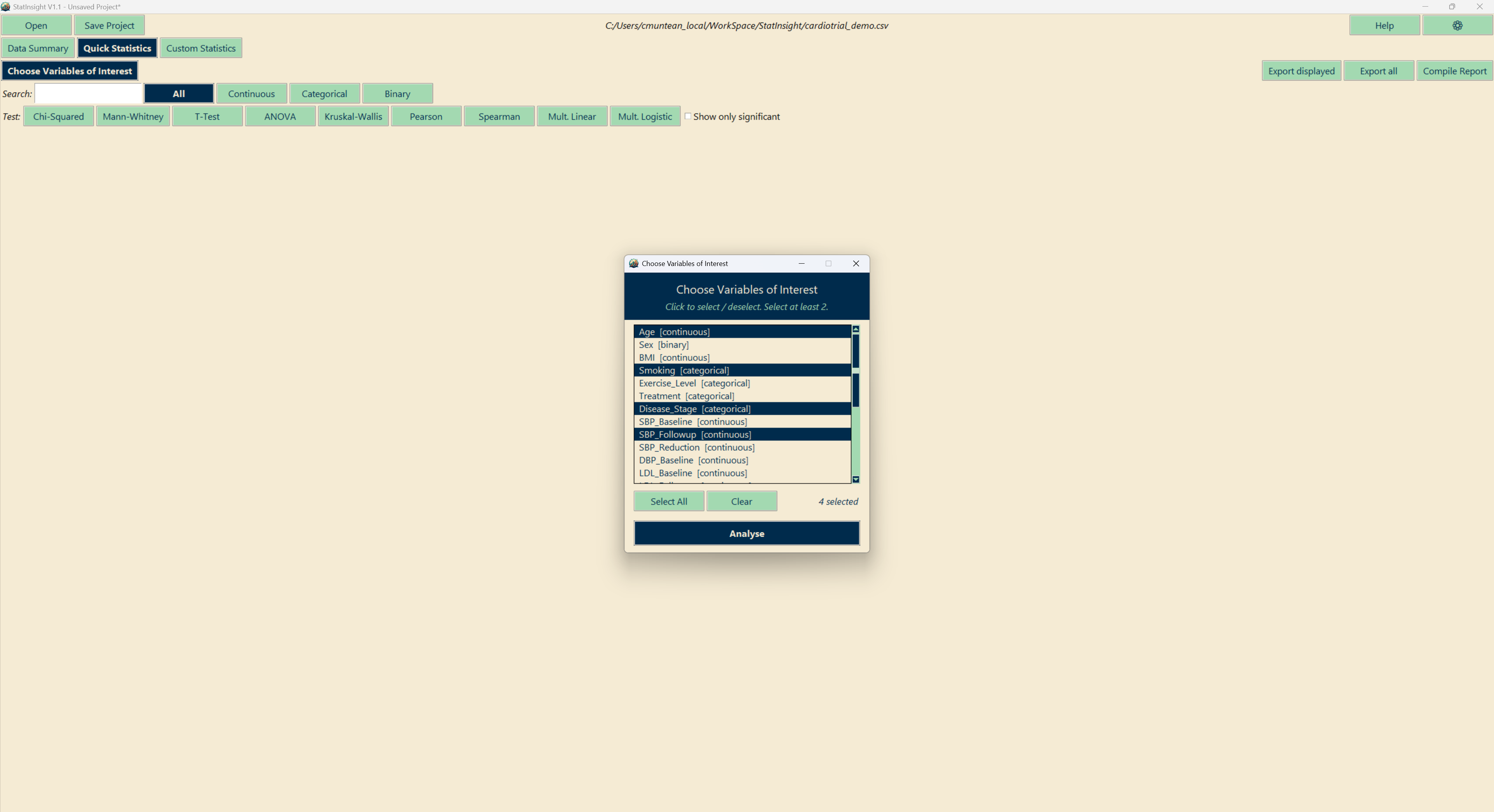
Click Choose Variables of Interest, tick the variables and press Analyse: Quick Statistics runs the appropriate test for every valid combination — chi-square, t-test or Mann-Whitney, ANOVA or Kruskal-Wallis, Pearson or Spearman, chosen from the variable types and the normality assessment — plus a multiple linear or logistic regression for each continuous or binary variable against the others.
Video tutorial
What's included in each result
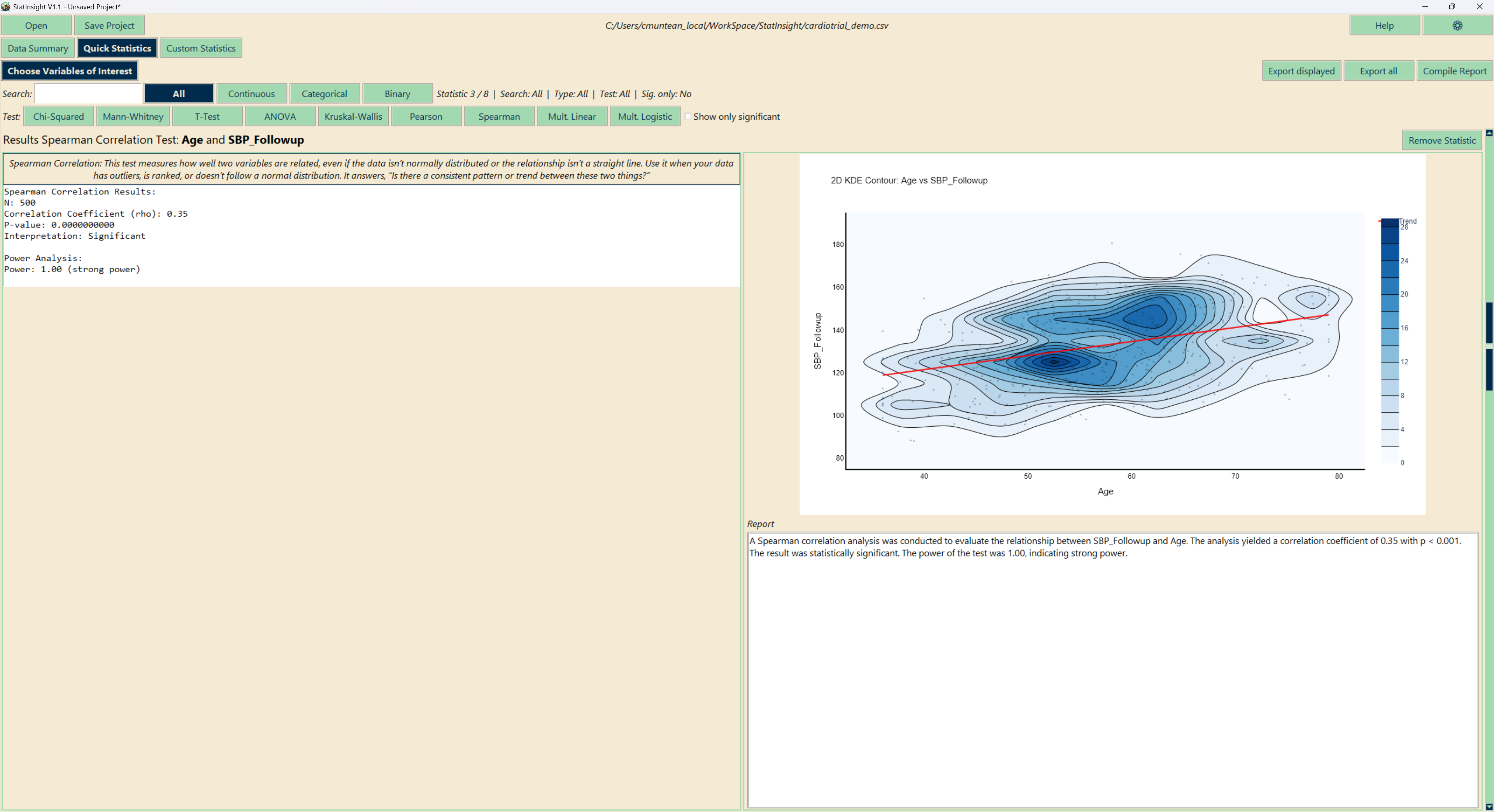
Each result shows the test name, the variables tested, the key statistics, a chart and a plain-English report paragraph. Significant results (p < 0.05) are highlighted. Results can be filtered, exported and summarised with Compile Report — a short Word document with the three most prominent findings. See the Export section for details.
Custom Statistics
The Custom Statistics tab lets you choose a specific test and configure exactly which variables to compare. Click Variable Test, move variables into the selection, and the tests that fit the selection light up on the right — the configuration panels for the chosen test appear below. This is the right choice when you have a defined hypothesis or need a test not covered by Quick Statistics.
Video tutorial
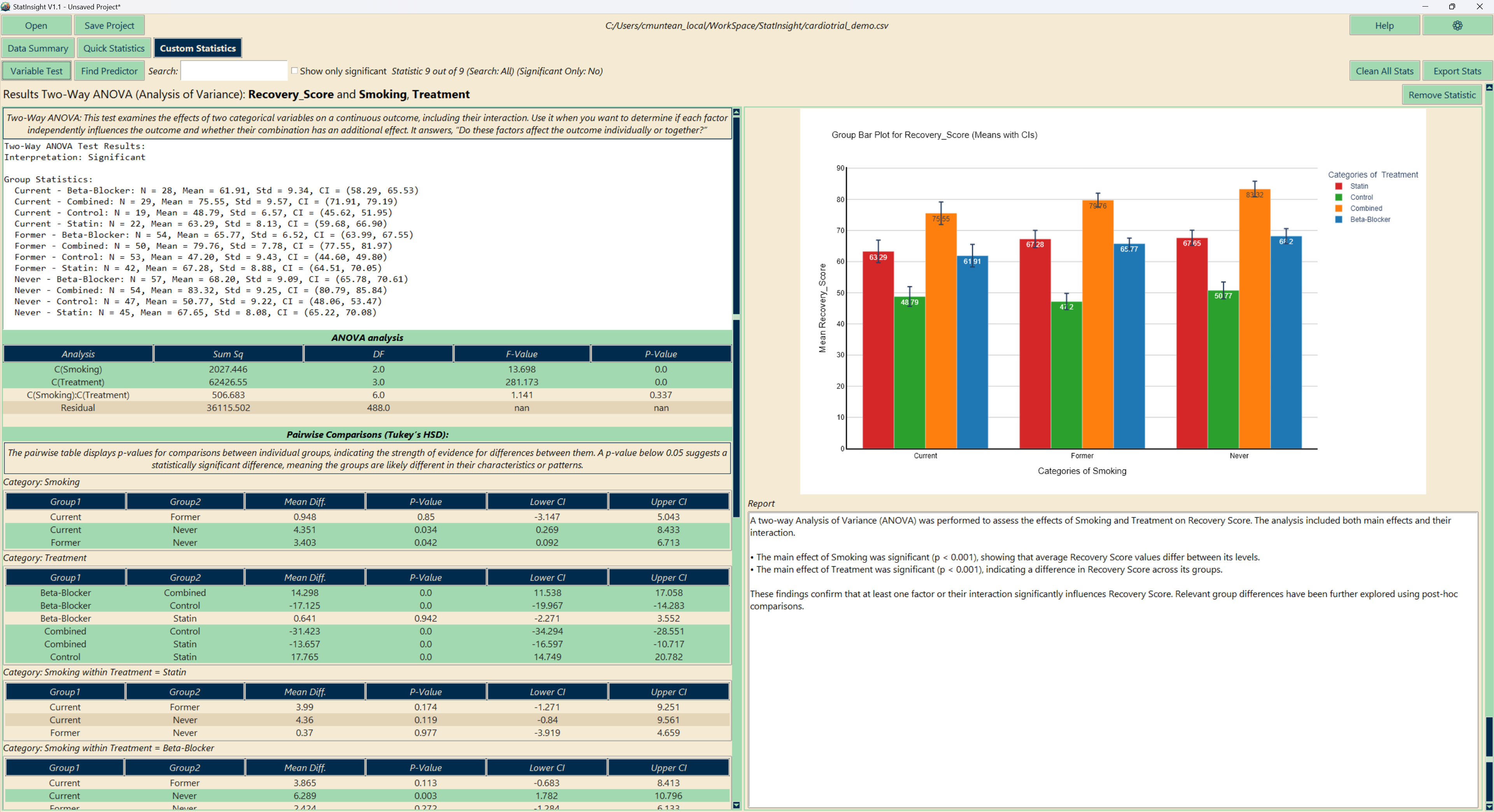
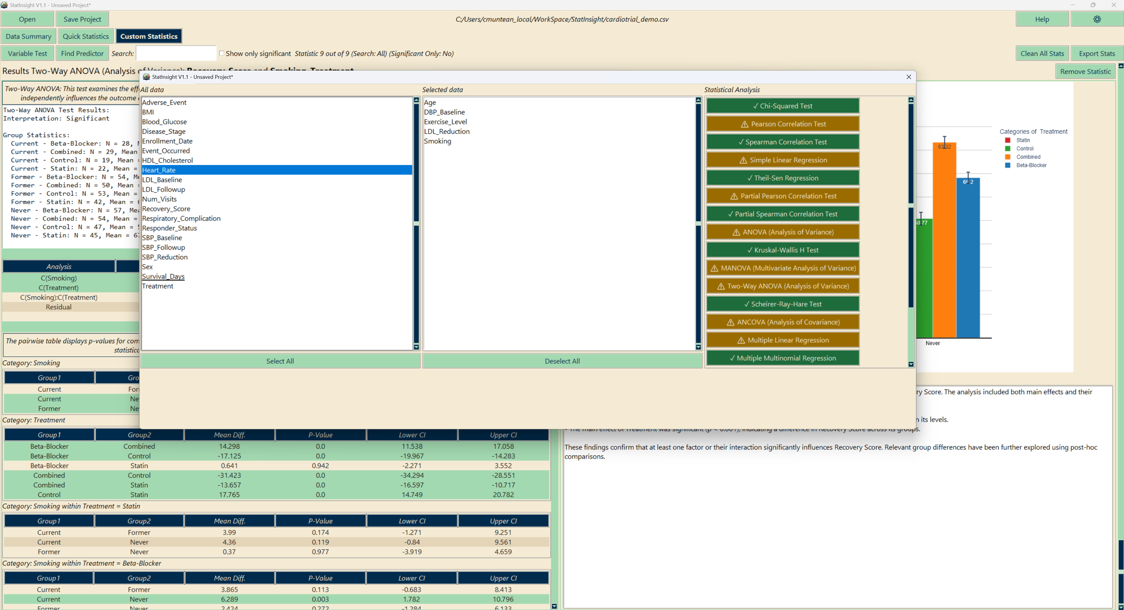
Assumption-aware guidance
Before you run a test, StatInsight evaluates whether your selected data meets the test's assumptions and displays a colour-coded indicator:
Available tests
| Category | Tests |
|---|---|
| Comparison | T-Test, Paired T-Test, Mann-Whitney U, Wilcoxon, ANOVA, Kruskal-Wallis, Repeated Measures ANOVA, Two-Way ANOVA, Scheirer-Ray-Hare, Friedman, ANCOVA, MANOVA |
| Correlation | Pearson, Spearman, Partial Pearson, Partial Spearman |
| Categorical | Chi-Squared Test |
| Survival & diagnostic | Kaplan-Meier Analysis, ROC Curve Analysis |
| Regression | Simple Linear, Theil-Sen, Multiple Linear, Multiple Logistic, Multinomial Logistic |
| Normality & agreement | Shapiro-Wilk normality test, Cohen’s Kappa, Fleiss’ Kappa, Kendall’s W, Percent Agreement (OPA/PPA/NPA) |
| Automatic | AutoPrediction (predictor selection) |
Paired and repeated-measures designs
Paired T-Test, Wilcoxon, Repeated Measures ANOVA and Friedman match observations by a Subject ID column you pick — any column in the file, whether or not it was selected for analysis — instead of by row order. Repeated measures can be stored long (a condition column and a value column) or wide (one column per time point); both layouts have their own panel. Batches of paired tests can be Bonferroni-corrected across the whole batch.
Post-hoc Procedures
Every result with a pairwise table has a Post-hoc test dropdown directly above it. Only the procedures valid for that test’s design are offered — 31 in total across the app, from Tukey HSD, Games-Howell, Scheffé, Tamhane T2 and Dunnett to Dunn and Conover-Iman with a choice of correction, Nemenyi, DSCF, Mann-Whitney, and the Friedman-specific Nemenyi, Conover, Siegel and Miller variants.
Video tutorial
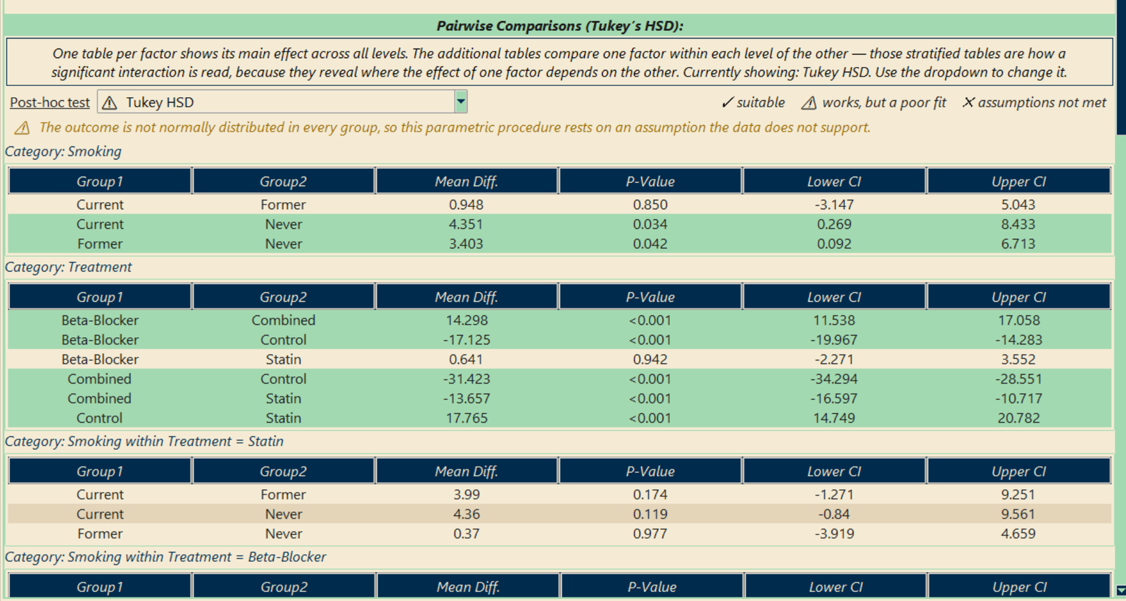
Suitability marks
Each entry is marked and coloured by how well it suits your data, using the same traffic-light convention as the test buttons, and the reason for the current selection is shown beneath the dropdown:
- Selecting a different entry recomputes the table in place; row order is identical across procedures, so p-values can be compared column by column.
- The dropdown opens on the procedure that was actually computed, so it always matches the table on screen.
- Choosing Dunnett reveals a second dropdown for the control group.
- Your choice becomes the default for that test, is stored in the project file and is used by the Word export.
AutoPrediction
AutoPrediction automatically identifies which variables in your dataset are most likely predictors of a chosen outcome variable. Select your outcome and let StatInsight run a battery of machine learning feature selection methods to rank the remaining variables by predictive importance.
Video tutorial
Methods used
Results are presented as a ranked summary table and a predictor-significance chart. Each top predictor is then tested individually with the appropriate statistical test, and the combined model is cross-validated with the feature selection repeated inside every fold, so the reported performance is honest.
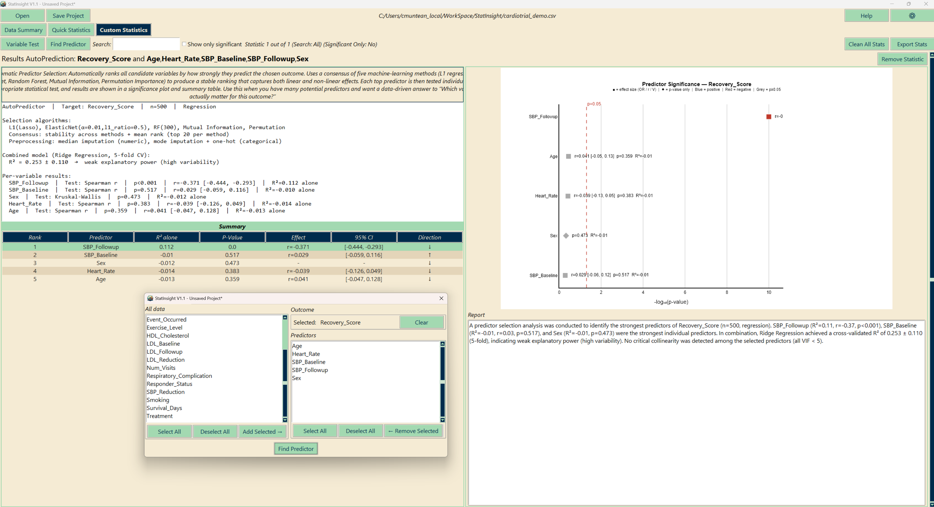
Multiple Comparisons
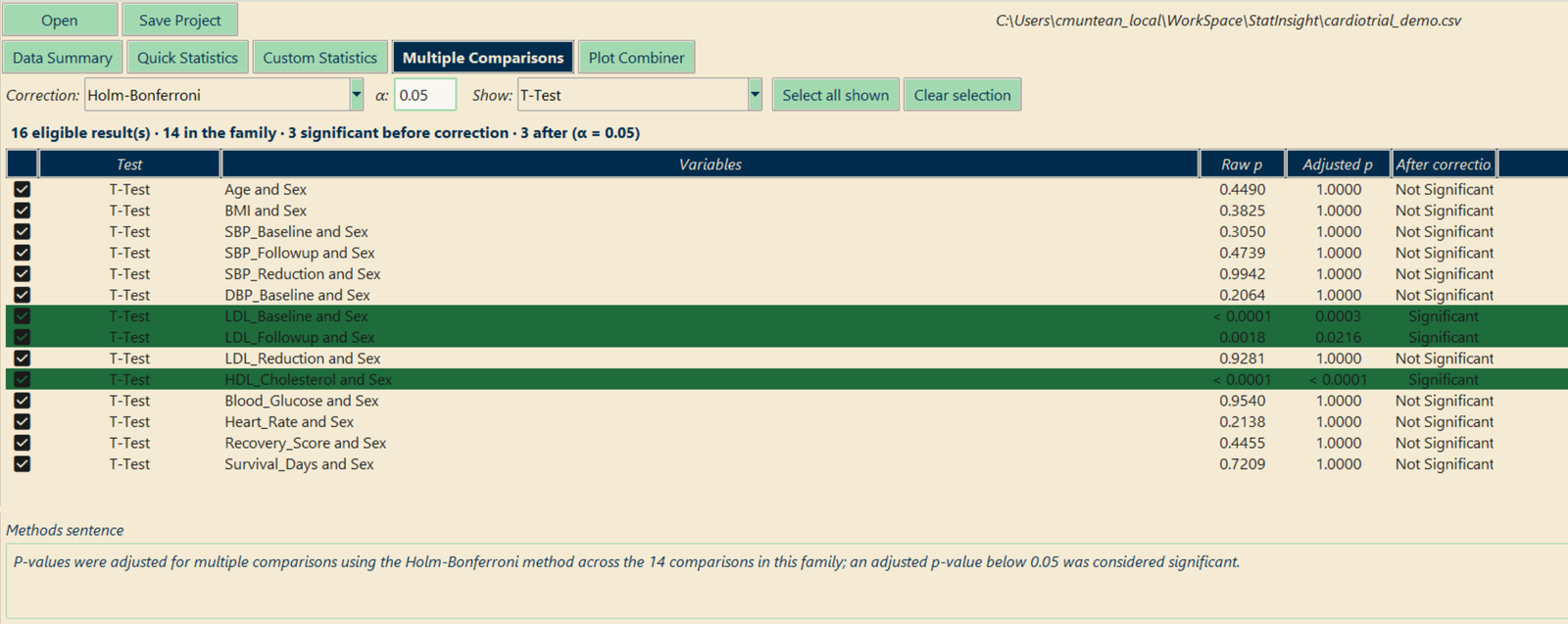
Run a t-test on eighteen variables and each carries its own 5 % chance of a false positive — the chance of at least one is about 60 %. The Multiple Comparisons tab lists every finished result whose test produces a single clean p-value; you tick the ones that belong together, and it shows the adjusted p-values beside the raw ones.
Video tutorial
Procedures
| Controls | Methods |
|---|---|
| Family-wise error rate | Bonferroni, Holm-Bonferroni (default), Šidák, Holm-Šidák, Hochberg, Hommel |
| False discovery rate | Benjamini-Hochberg, Benjamini-Yekutieli |
How it works
- You define the family. Which results belong together is a judgement call, so nothing is grouped automatically. Filter by test with Show and click Select all shown when one test was run over many variables.
- Nothing is overwritten. The correction is a view: raw p-values are untouched and switching procedure recomputes from them, so a correction can never compound.
- Rows that lose significance are highlighted in yellow; rows that stay significant in green.
- The methods sentence is written for you — “P-values were adjusted for multiple comparisons using the Holm-Bonferroni method across the 14 comparisons in this family…” — and Export table writes it with the full table to Word.
- Tests with their own pairwise stage (ANOVA, Kruskal-Wallis, Friedman, the factorial and repeated designs) are deliberately excluded: their comparisons are already corrected by the post-hoc procedure chosen on the result itself.
Plots & Plot Editor
Every result in StatInsight is accompanied by a chart, chosen to suit the test — and switchable to any of the other chart types that fit the same result, without re-running the test. Over 70 chart types are available; a default per test can be set in Preferences.
Chart types by result
| Result | Charts |
|---|---|
| Single variable | Histogram, histogram + normal curve, violin, box, strip, ECDF, Q-Q plot; bar, pie, treemap, lollipop; time-area, time-line, box per period |
| Group comparisons | Means bar and error bar, multi-boxplot, box + points, violin, raincloud, strip, multi-histogram, ECDF per group, means heatmap, spaghetti and means line for paired data |
| Two factors | Interaction plot, interaction lines, grouped means bars, adjusted means (ANCOVA), radar and parallel coordinates (MANOVA) |
| Categorical | Stacked bar (counts or %), grouped bar, contingency heatmap, mosaic plot |
| Correlation & regression | Scatter + trend line, scatter + marginals, hexbin density, 2-D KDE contour, residual plots, coefficient forest and heatmap, actual vs predicted, scatter matrix |
| Logistic & classification | Odds-ratio forest, probability distribution, ROC, precision-recall and lift curves, log-log plot |
| Survival & diagnostic | Kaplan-Meier (with confidence bands and censor marks), reversed KM, cumulative hazard, ROC curve with optimal cut-off |
| AutoPrediction & agreement | Predictor forest, importance bars, method-score heatmap, kappa forest, agreement matrix heatmap, rank concordance lines |
The Plot Editor
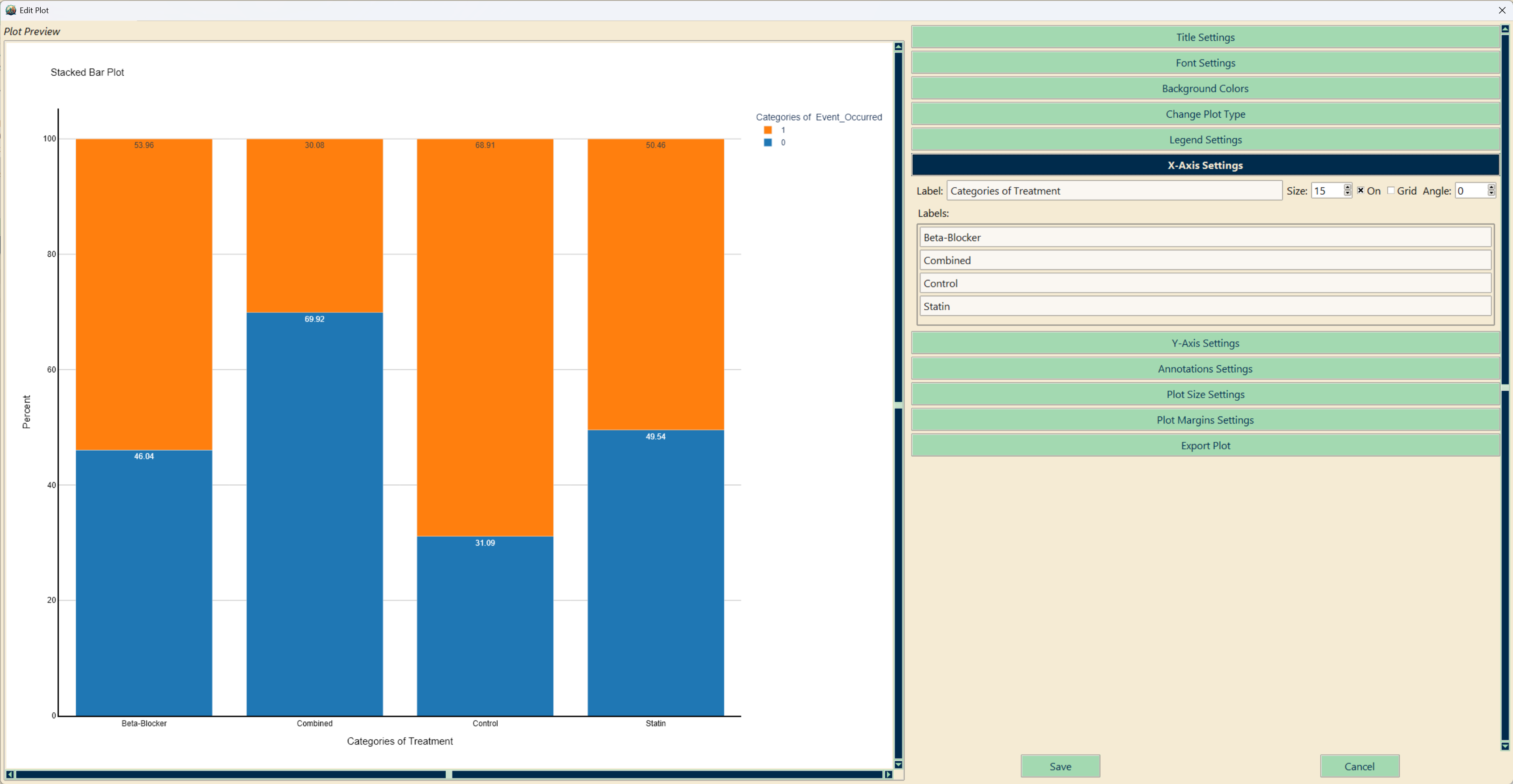
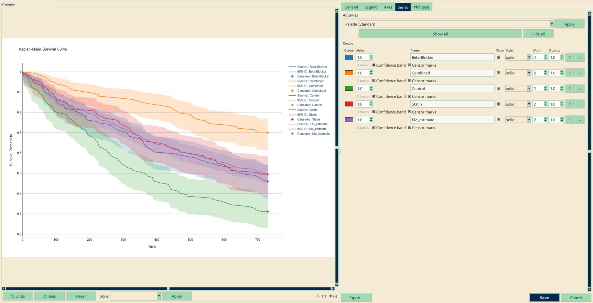
Click any chart to open the editor: a live preview on the left, tabs on the right — and only the tabs that apply to the figure in front of you. A heatmap gets a colour-scale tab, a multi-panel figure a panels tab, a survival plot gets one row per arm with its confidence band and censor marks as toggles.
- General — title, size with journal single-/double-column presets, margins, backgrounds, fonts, scale all text, export format and scale
- Legend, Axes — position and orientation; tick angle and number/date formats, ranges, log scale, grid and axis lines, category renaming and ordering
- Series — colour, name, visibility, line dash / marker symbol / bar pattern, width, opacity, order; a palette for all series at once; per-category colours for bars and pies
- Labels & Lines — data labels, error bars (95 % CI, SD or SE), annotations, reference lines and shapes
- Style presets — Publication (colour), Publication (greyscale) and Presentation; greyscale tells series apart by dash, symbol and hatching, not shade alone
- Undo/redo, reset, and export as PDF, SVG, PNG, JPEG or WEBP at 1–8× scale. Edits are saved with the project and used by the Word export.
Plot Combiner
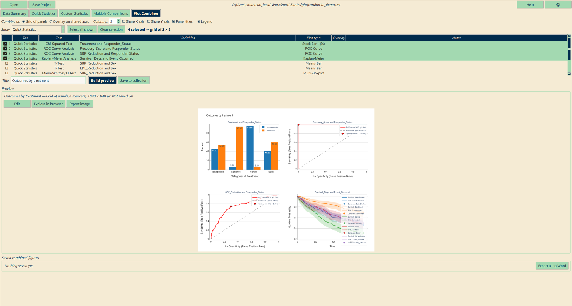
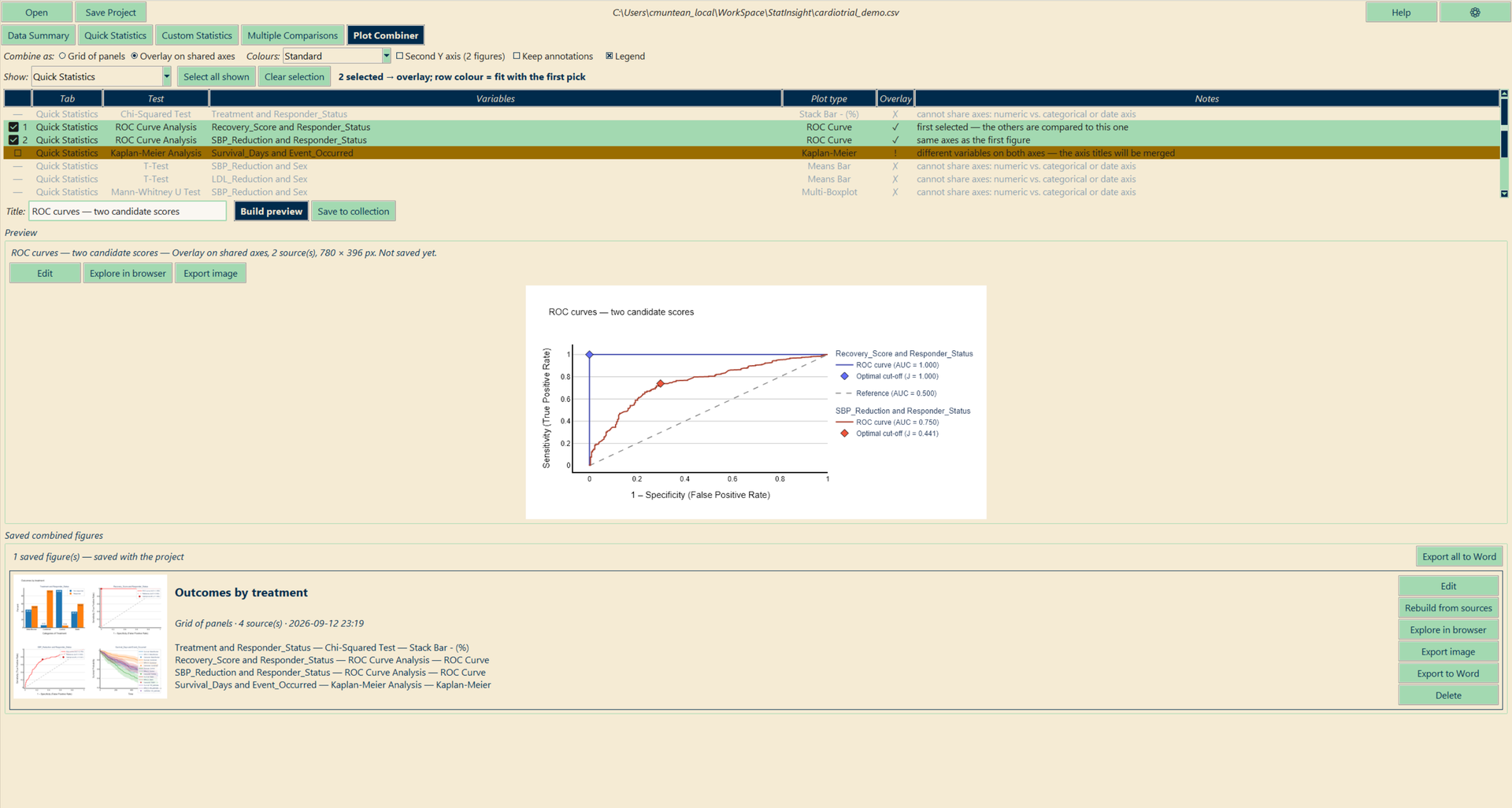
The Plot Combiner tab takes figures you already have — from Data Summary, Quick Statistics and Custom Statistics — and merges them into one, either as a grid of panels or as an overlay on shared axes. The result behaves like any other figure: edit it, export it, put it in a Word report; it is saved with the project.
Video tutorial
| Grid of panels | Overlay on shared axes | |
|---|---|---|
| What it does | Each figure becomes one panel of a multi-panel figure | All figures are drawn on one pair of axes |
| When it works | Always | When the figures’ axes agree — the tab tells you |
| Typical use | The multi-panel figure of a paper: baseline distributions, outcome by arm, survival — side by side | Several ROC curves on one plot; Kaplan-Meier curves from two analyses; two outcomes by the same group on two Y axes |
- Tick order is panel order; for an overlay, the first tick is the figure the others are compared to.
- Grading: as soon as the first figure is ticked, every other row is marked green (same axes), yellow (same axis types, different variables — allowed, titles merged) or grey (cannot share axes).
- Colours: each source figure gets one colour; shades of it keep the levels inside it apart. Bars from different sources sit side by side; a reference line present in every source is drawn once.
- Snapshots: a combined figure keeps its own copy of the sources, so it survives a deleted result; Rebuild from sources re-pulls the current figures when you want it to.
Export
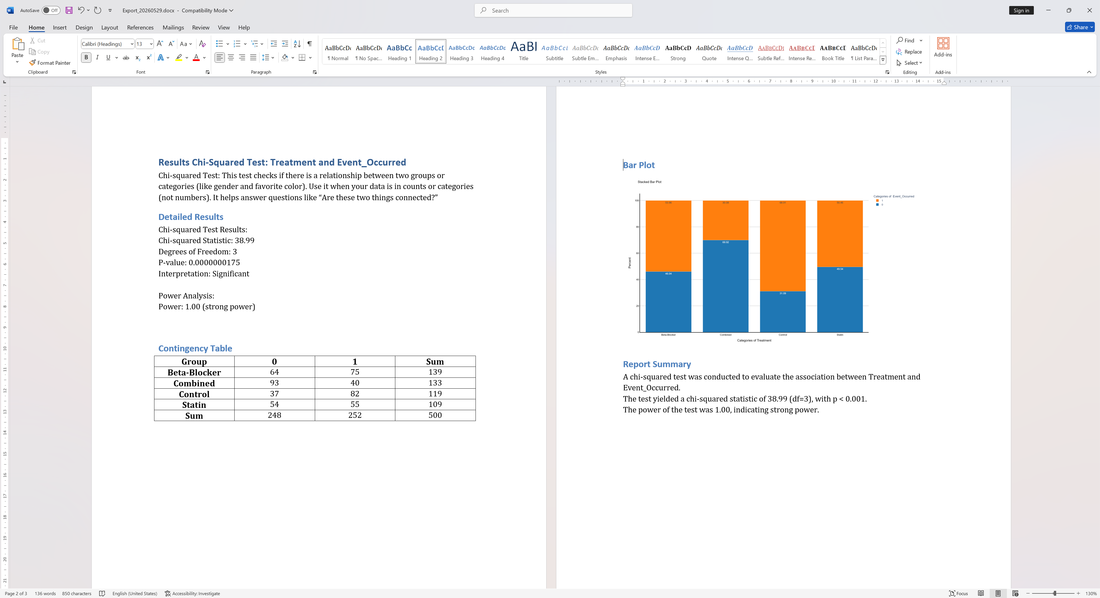
StatInsight exports results to Microsoft Word (.docx) format — ready to paste directly into a manuscript or report. Every tab has its own export button in its action bar.
Video tutorial
What's exported
- Statistical tables with all test metrics (test statistic, degrees of freedom, p-value, effect size)
- Embedded chart images for each result
- Pairwise comparison tables with the post-hoc procedure selected on screen
- Plain-language result interpretation paragraphs
- Regression summary tables with coefficients and confidence intervals
- Kaplan-Meier event tables
- Multiple Comparisons: the corrected family with its methods sentence
- Combined figures with their title and the list of source results
Export options
- Data Summary → Export — the descriptive statistics of every variable, grouped if a Group by variable is set.
- Quick Statistics → Export all / Export displayed — every result, or only those left by the current filters; Compile Report writes a short summary of the three most prominent findings.
- Custom Statistics → Export Stats — every result of the tab.
- Multiple Comparisons → Export table, Plot Combiner → Export to Word for one figure or all of them.
- Individual figures export as PDF, SVG, PNG, JPEG or WEBP from the Plot Editor.
Large sessions are split automatically into files of at most 100 results; the date is appended to the file name.
Preferences
The gear icon in the top-right corner opens the preferences:
- Language — English or German, applied immediately to the whole interface, the result texts and the reports.
- Colour scheme — eleven themes (Classic Cream, Violet & Green, Ocean Dusk, …), applied live.
- UI font — typeface and sizes. Text sizes are chosen for your screen automatically — a 16-inch laptop gets smaller text than a 4K monitor — and follow the screen when you dock or undock; Recommended for this screen brings the automatic choice back after manual changes.
- Image font — the font used inside exported charts.
- Default plot per analysis — which chart type each test shows first.