Statistics that
anyone can run.
StatInsight takes researchers, students and analysts from raw data to publication-ready results — 30 tests with assumption-aware guidance, 70+ charts, multiple-comparison correction, a plot combiner and one-click Word export. Zero coding.
Built in a medical statistics group · used in medicine, psychology, biology, business, education and engineering · trusted by researchers at


Everything you need to analyze your data
From loading a CSV to exporting a formatted Word report — StatInsight handles every step automatically.
Smart Automation
Variables are auto-classified, normality auto-assessed, and assumption-aware buttons tell you exactly which test to use — green, yellow, or red.
30+ Statistical Tests
T-Test, ANOVA, Chi-Squared, Kaplan-Meier, Regression, Correlation, MANOVA, Kruskal-Wallis, Friedman, AutoPrediction and more — all automated.
70+ Chart Types
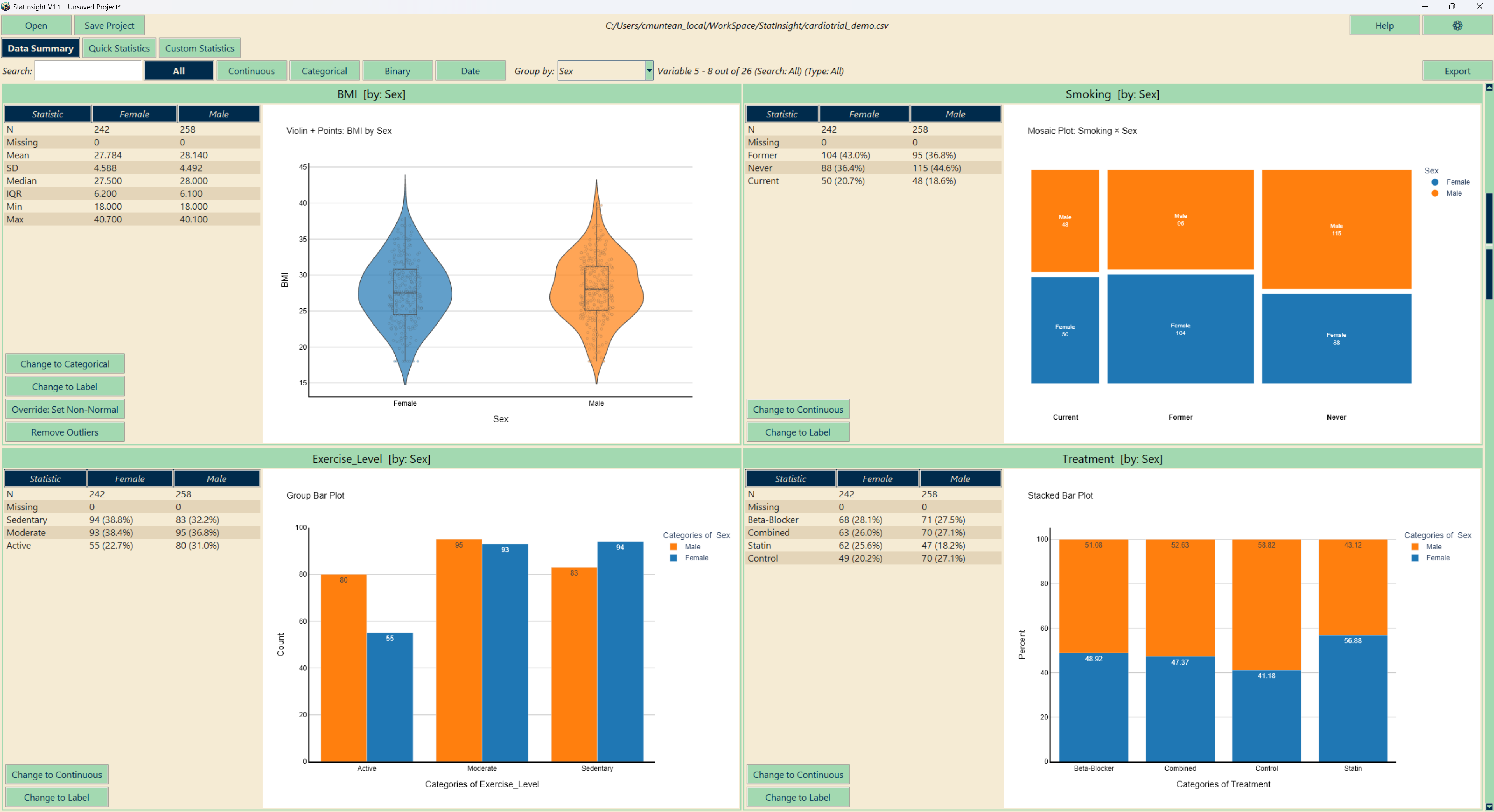
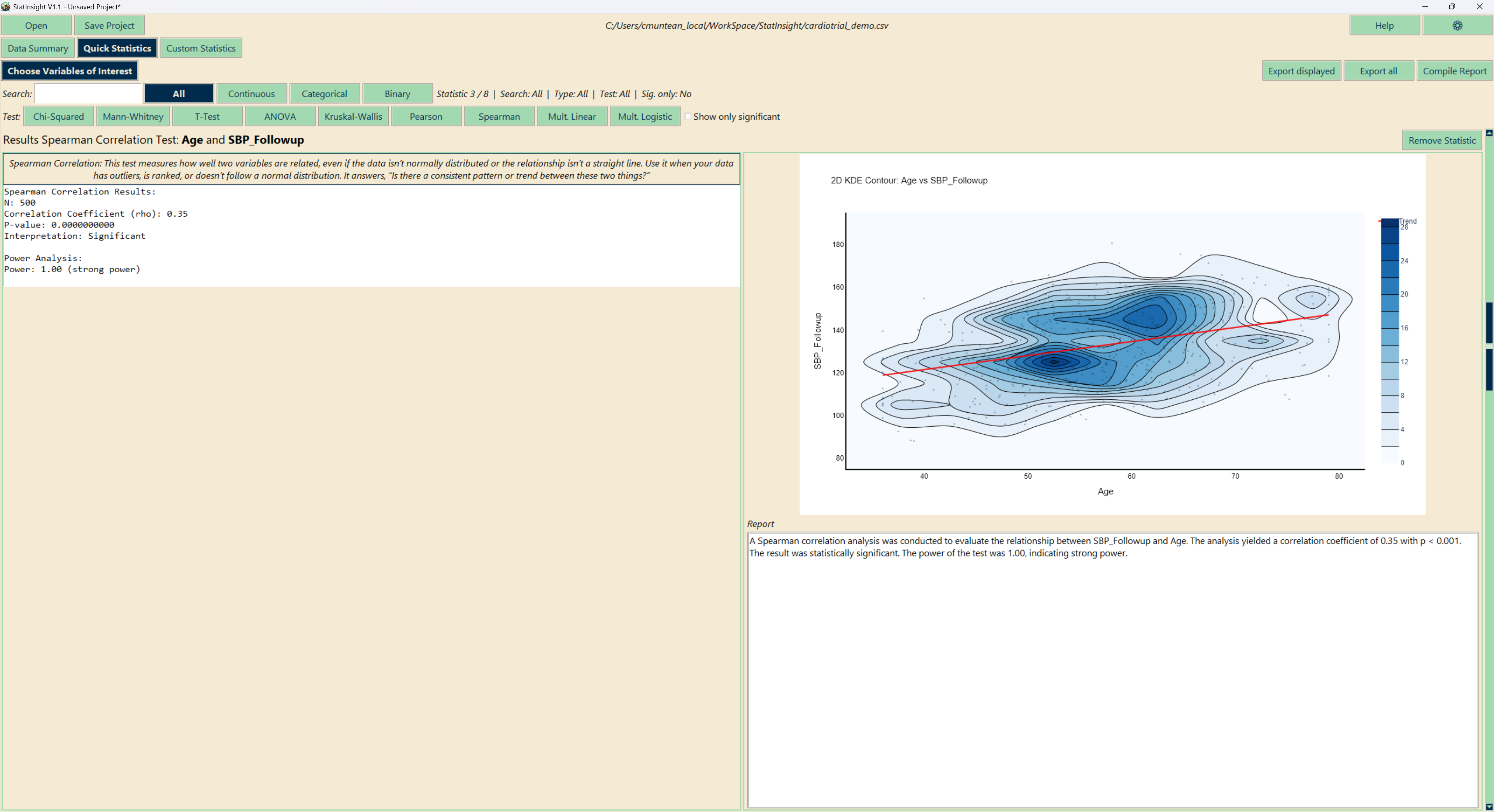
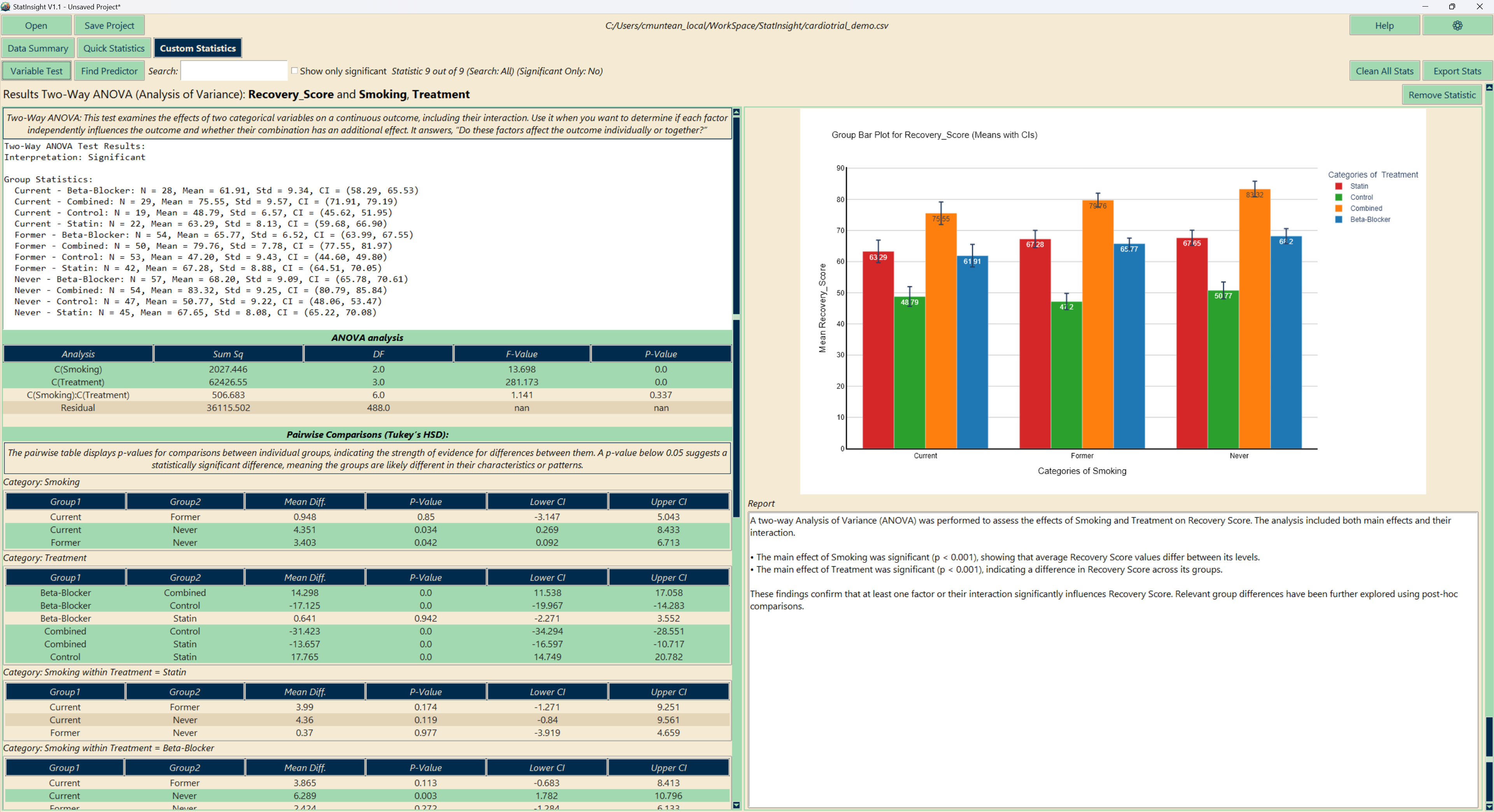
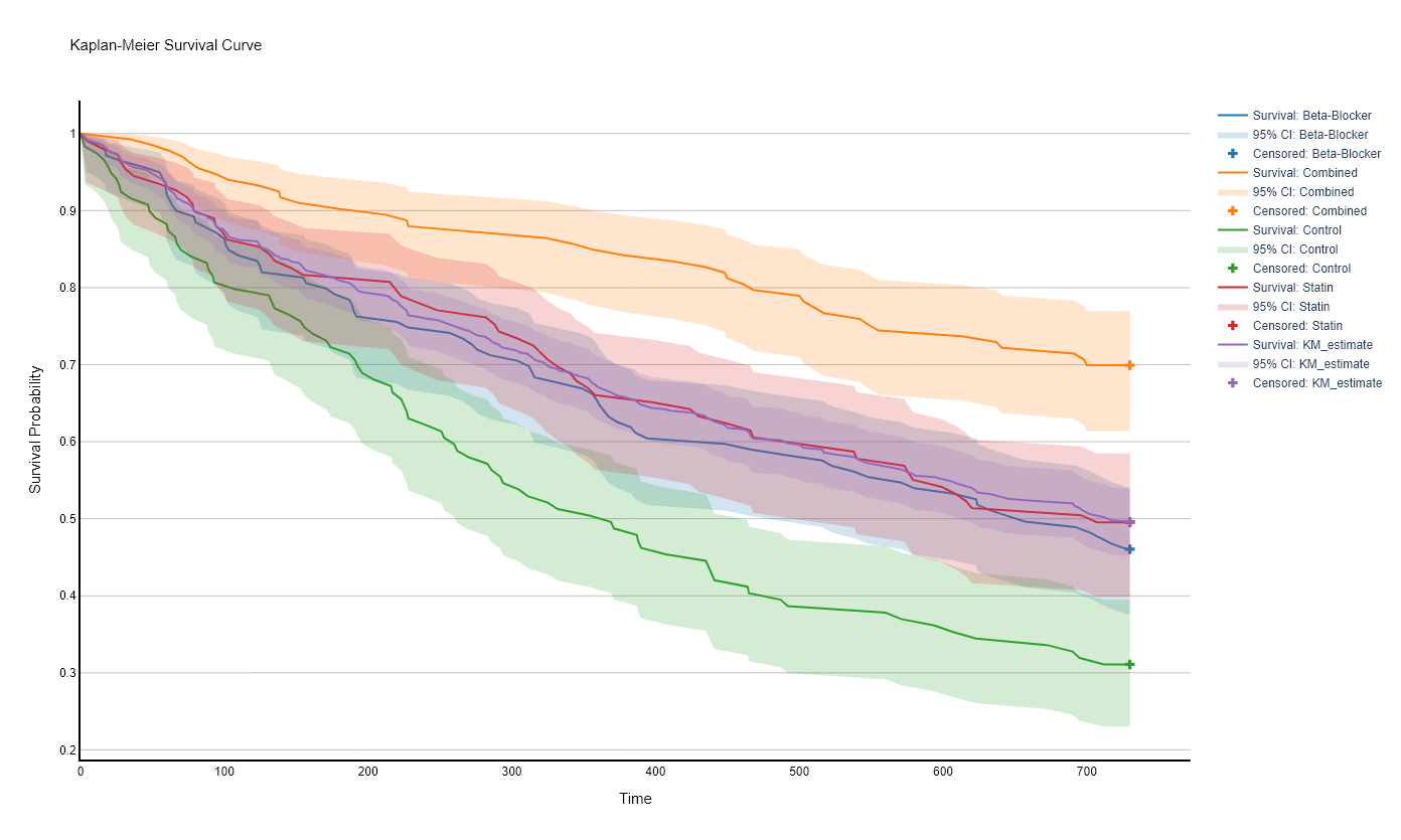
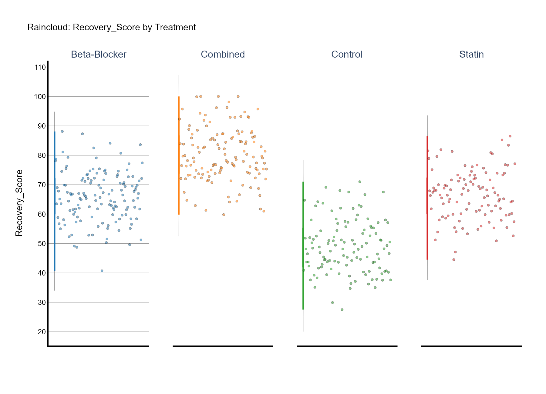
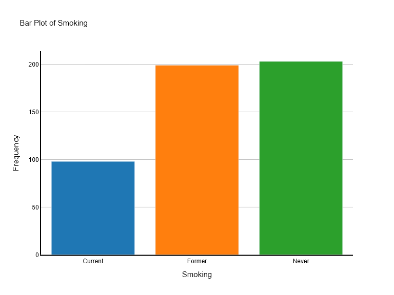
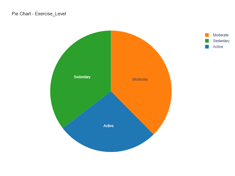
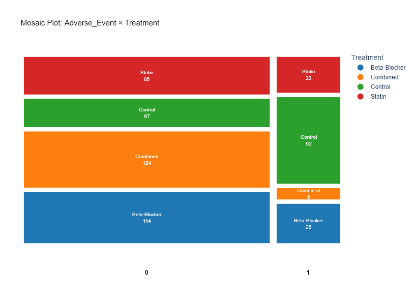
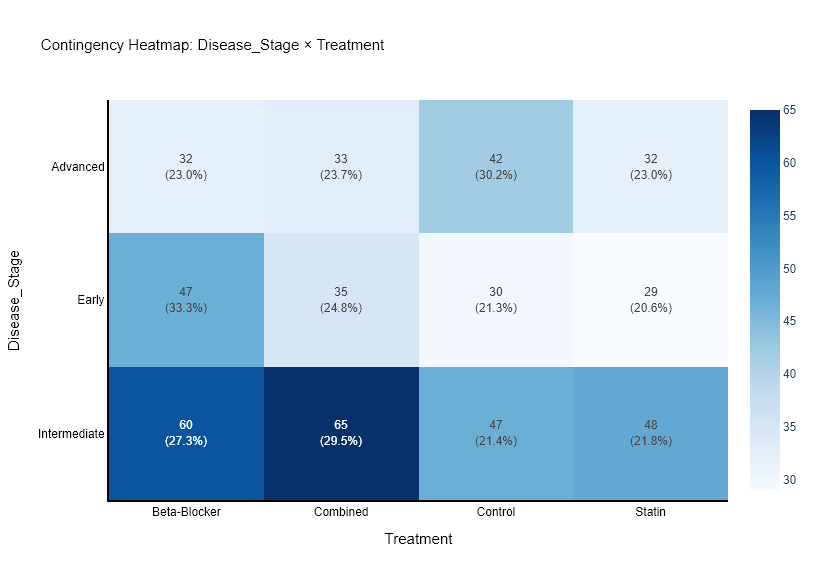
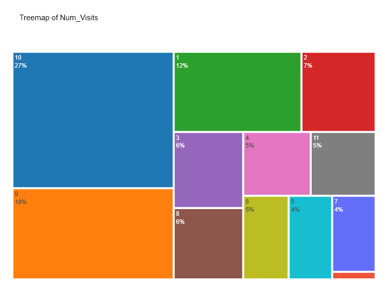
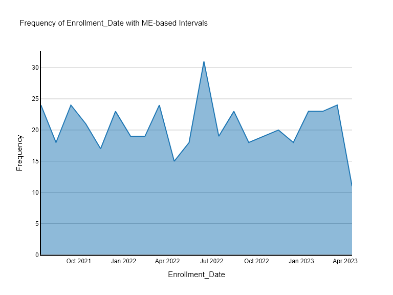
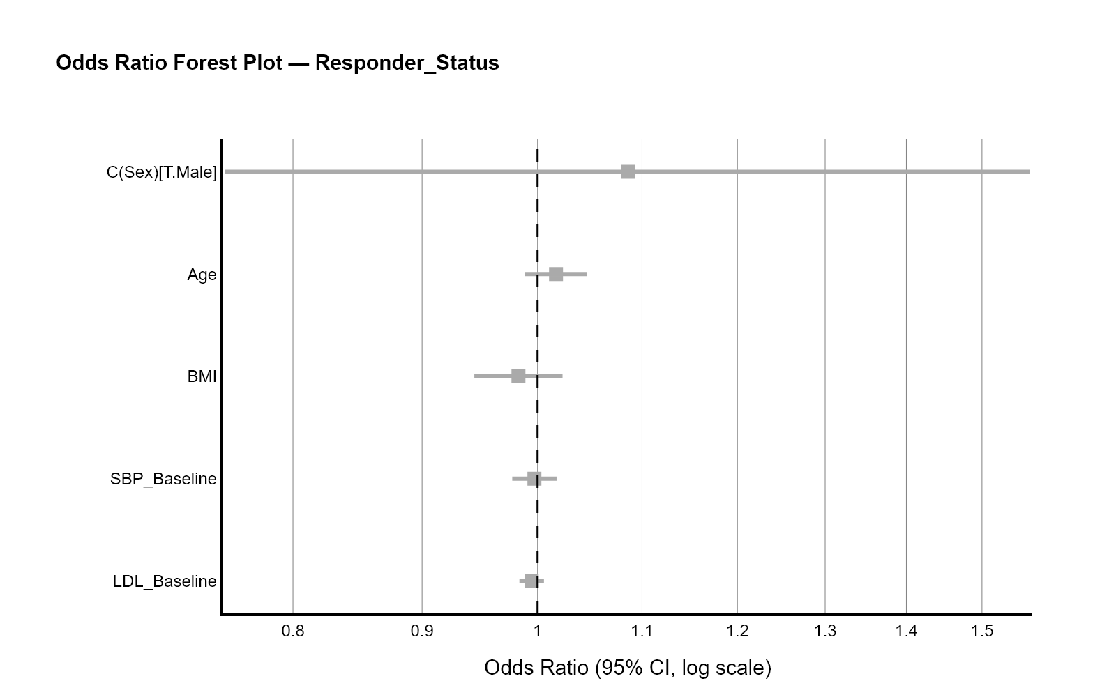
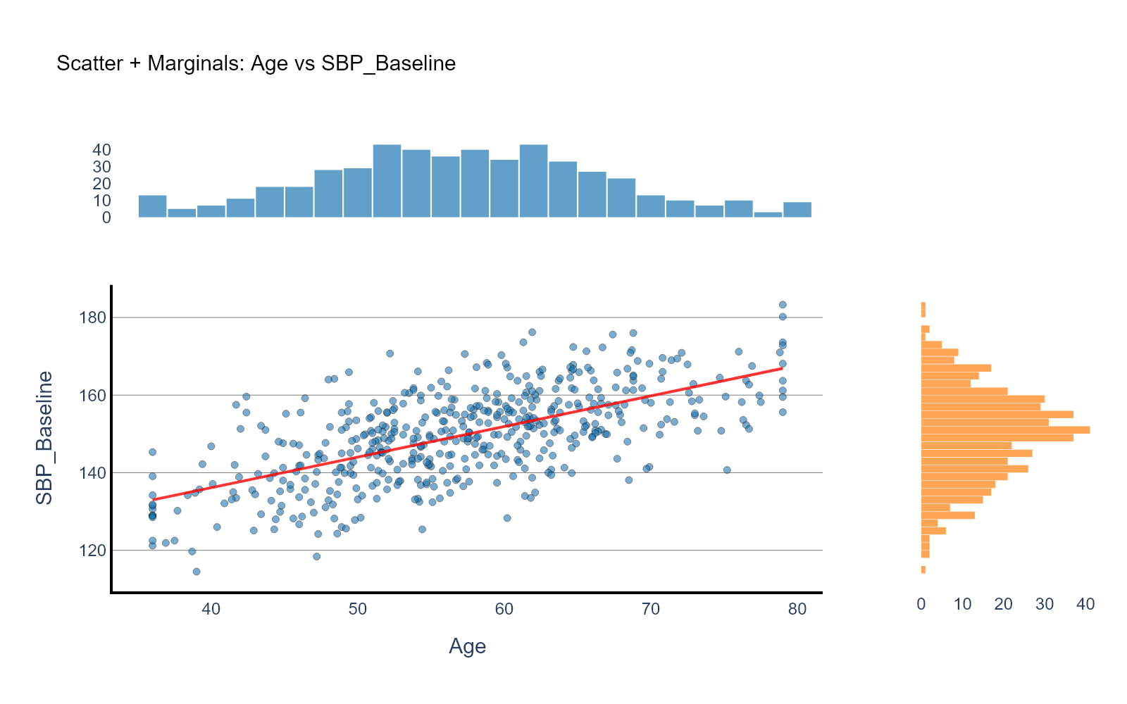
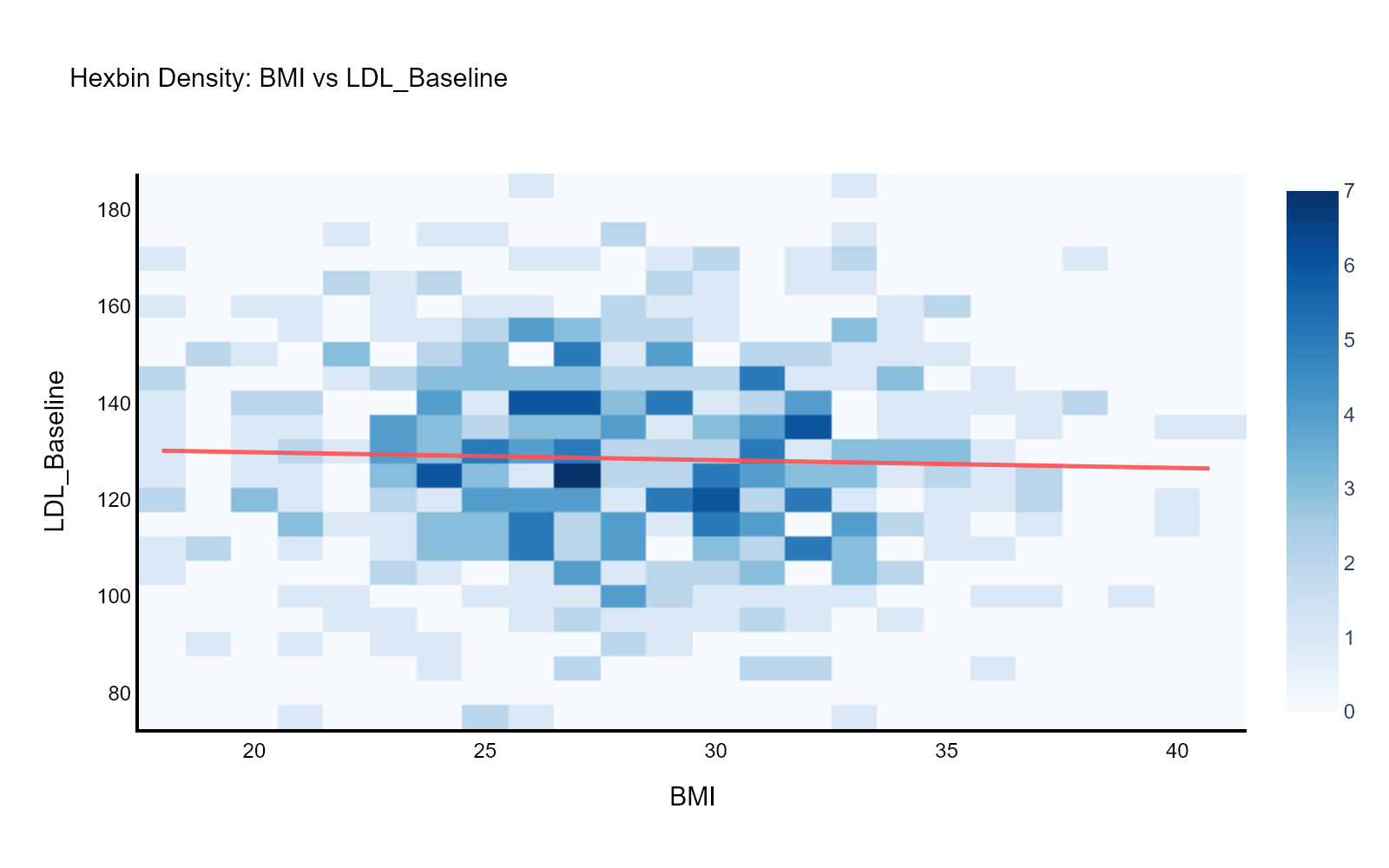
Histograms, rainclouds, violins, survival curves, forest plots, ROC curves, heatmaps, mosaics — every result gets the right chart, switchable to any compatible alternative.
Multiple Comparisons
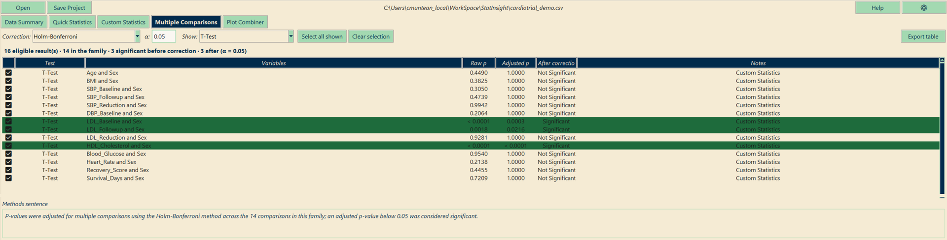
Ran one test over twenty variables? Tick the family and get Holm, Bonferroni, Hochberg, Hommel or Benjamini-Hochberg adjusted p-values — plus the methods sentence for your paper.
Plot Combiner
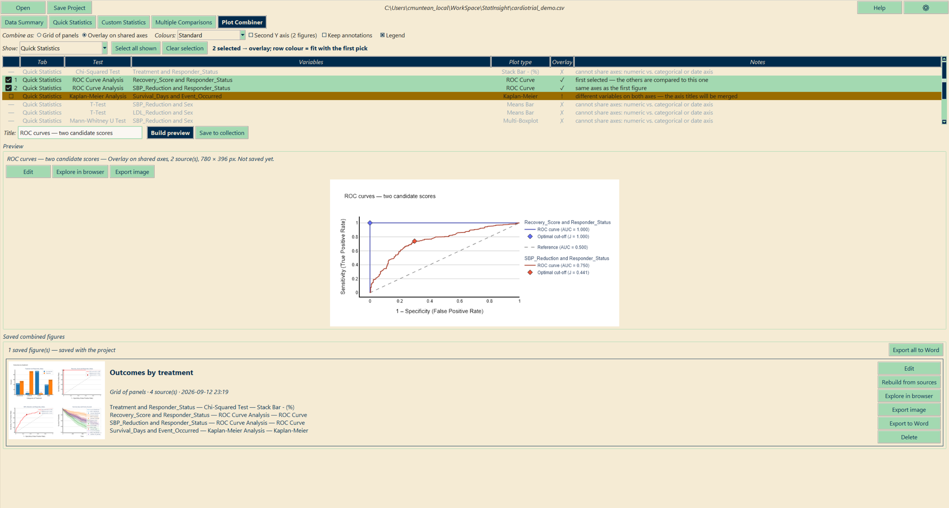
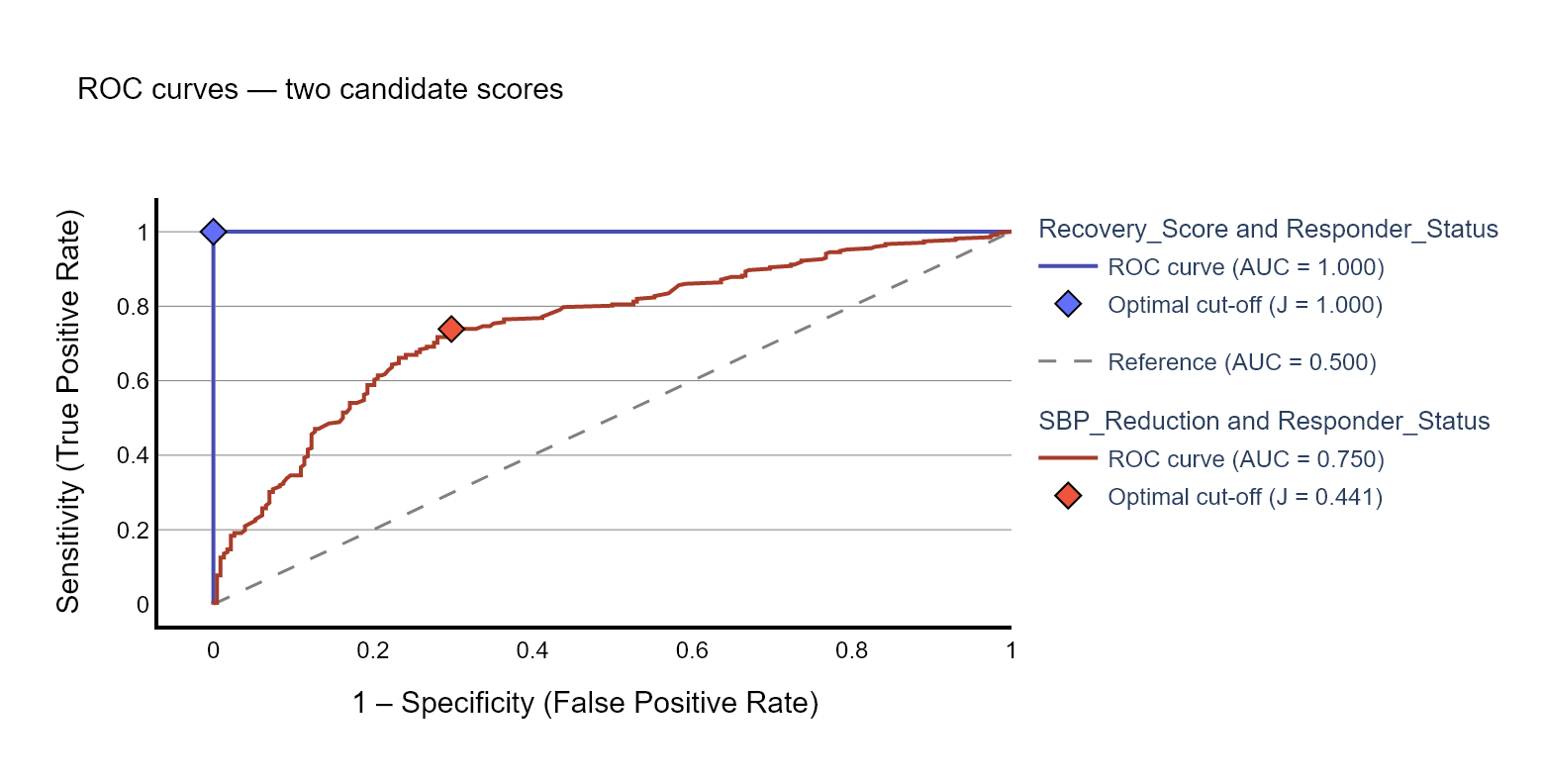
Turn finished figures into one: a multi-panel figure, two ROC curves on shared axes, survival curves from two analyses — the app tells you what fits before you build.
Selectable Post-hoc Tests
31 pairwise procedures — Tukey, Games-Howell, Dunn, Dunnett, Nemenyi and more — each marked green, yellow or red for your data, switched in place with the table updating live.
Fully Offline
Runs entirely on your machine after activation. No cloud, no server, no data ever leaves your computer — ideal for sensitive clinical datasets.
Publication-Ready
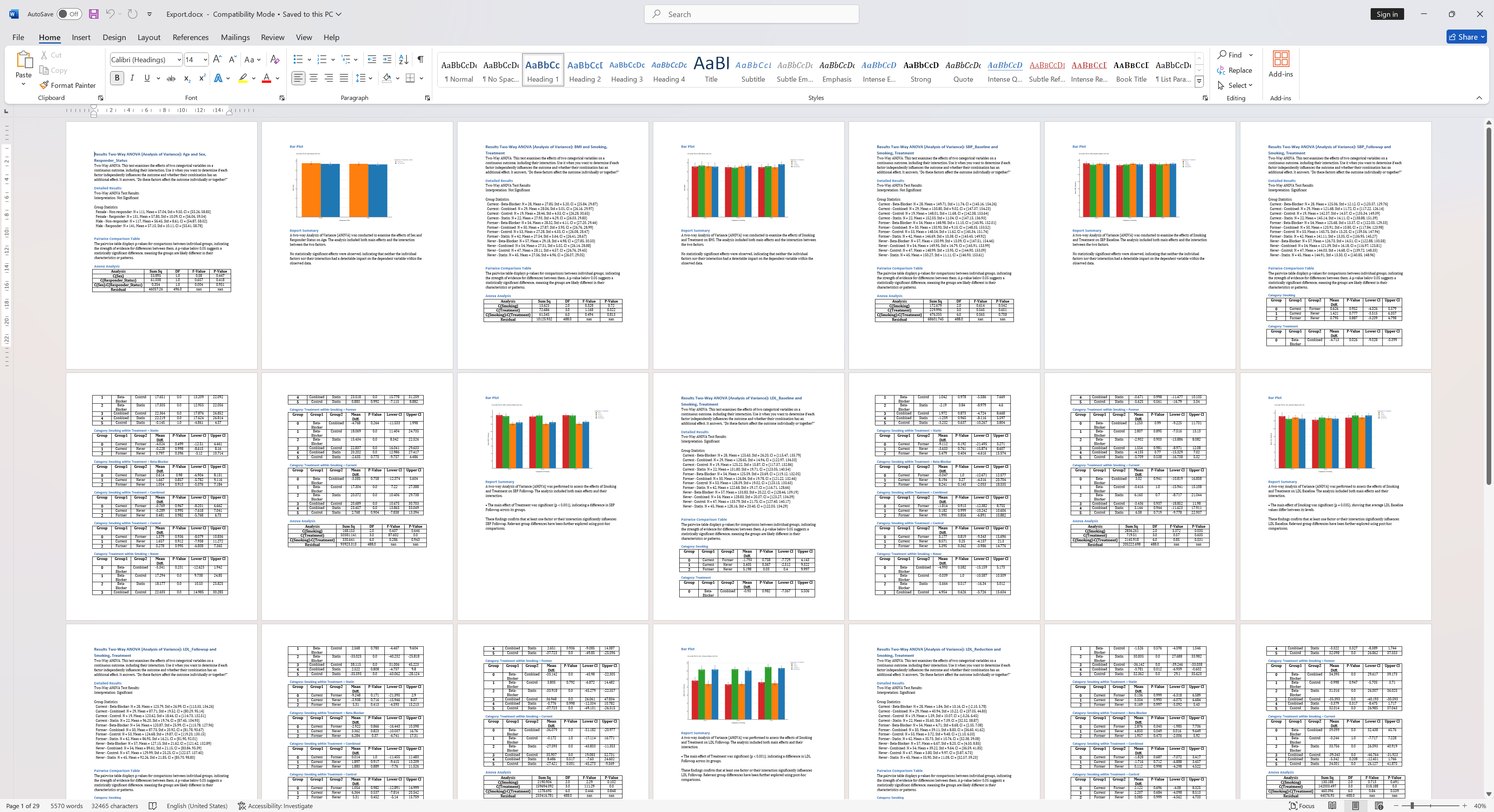
One-click Word export with embedded charts, pairwise tables, and report-ready paragraphs. A plot editor with journal-size presets, greyscale styling and PDF/SVG export finishes the figures.
14-Day Free Trial
Try all 30 tests, AutoPrediction, the plot combiner and multiple-comparison correction for 14 days. No credit card required. One click to get started.
From data to results in 3 steps
No setup, no configuration. Open your file and follow the flow.
Open your file
Load any CSV, Excel, or RTF. StatInsight classifies every variable as continuous, categorical, binary, or datetime and builds a full descriptive summary automatically.
Run the analysis
Pick the variables and let Quick Statistics test every combination, or choose one of 30+ tests by hand. Assumption-aware traffic lights guide you before you click Run. Results appear in under a second.
Export results
Correct the p-values as a family, combine figures into a multi-panel plot, polish them in the editor — then one click exports everything to a formatted Word document.
The same app, your kind of data
Six demo datasets, each with three worked examples from the app — pick the one that looks like your study.
Psychology
Pre/post scores, two groups, Likert scales: t-test, Wilcoxon, Spearman, ANOVA.
Did the intervention work? →Education
Three teaching methods and a pre-test: ANOVA with post-hoc, ANCOVA, regression.
Which method works best? →Customer analytics
Time to cancellation by plan: Kaplan-Meier, logistic regression, chi-square.
When do customers leave? →Marketing
An A/B test done properly: chi-square on conversion, Mann-Whitney, odds ratios.
Did variant B really win? →Agriculture & biology
A factorial field trial: two-way ANOVA with interaction, correlations, Kruskal-Wallis.
Which treatment yields most? →HR & people analytics
Attrition predictors ranked, quantified with odds ratios, satisfaction by department.
Why are people leaving? →The steps other tools leave to you
Reviewers ask for corrected p-values, the right post-hoc test and a proper multi-panel figure. StatInsight has a tab for each.
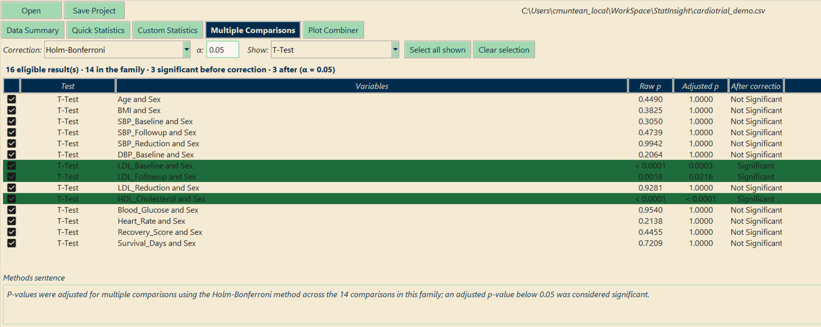
“Were the p-values corrected for multiple testing?”
Run a t-test on eighteen baseline variables and the chance of at least one false positive is about 60 %. The Multiple Comparisons tab lists every finished result, you tick the ones that form a family, and the adjusted p-values appear beside the raw ones.
- Nine procedures — Bonferroni, Holm, Šidák, Holm-Šidák, Hochberg, Hommel, Benjamini-Hochberg, Benjamini-Yekutieli
- Rows that lose significance are highlighted — the ones a reviewer would have caught
- The methods sentence is written for you, and the table exports to Word
- Never compounds: the correction is a view on the raw p-values, so switching method can never double-correct
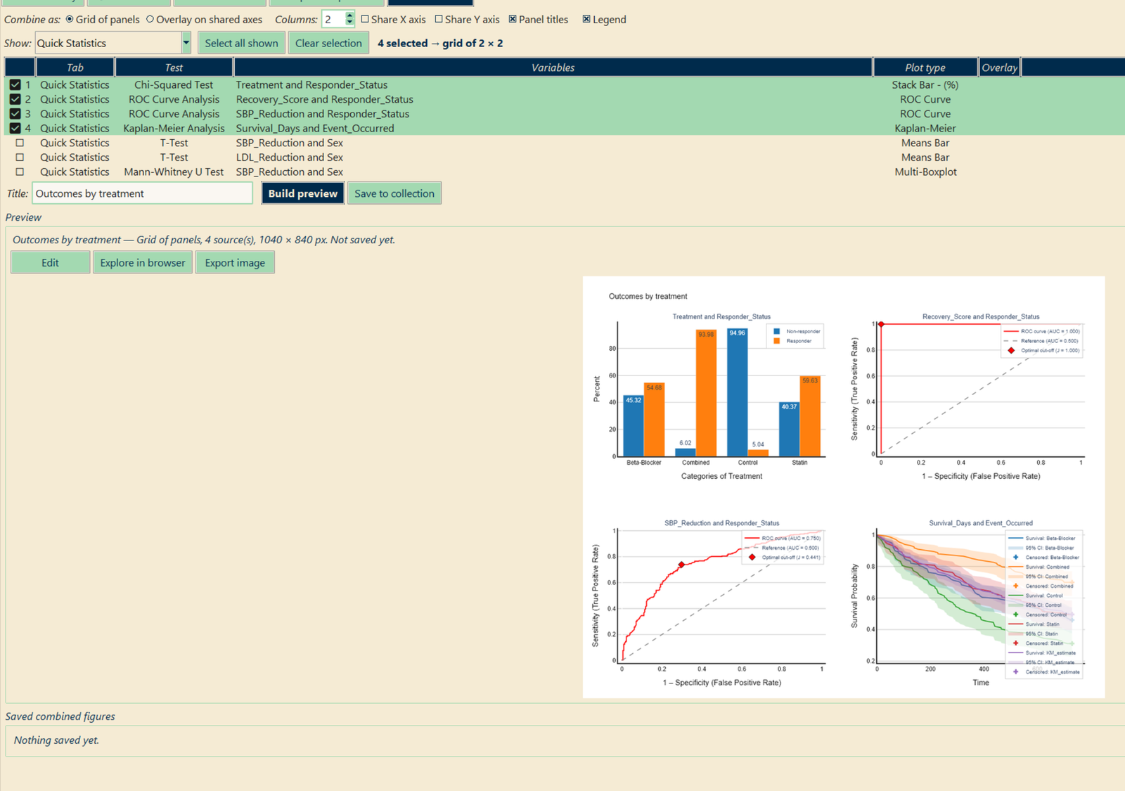
One figure, built from the results you already have
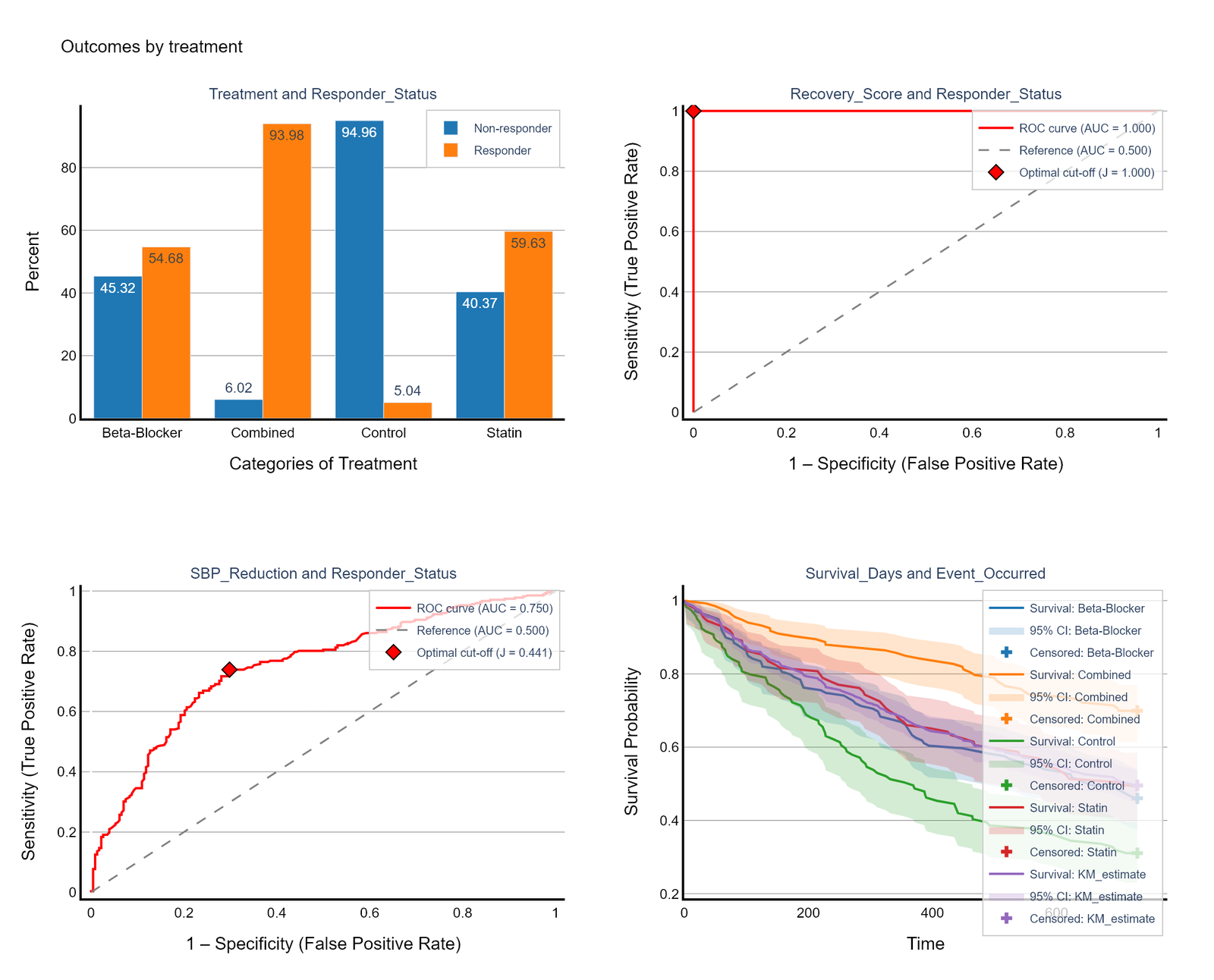
Every result comes with a figure. Tick the ones you want and get a multi-panel grid — or draw them on one pair of axes: several ROC curves on one plot, survival curves from two analyses, the same test before and after excluding outliers.
- Grid or overlay, with shared axes, panel titles and a legend per panel
- It tells you what fits — each figure is graded green, yellow or grey against the first one you tick
- Each source keeps one colour; shades keep the levels inside it apart
- Opens in the plot editor, exports as PDF/SVG/PNG or to Word, and is saved with the project
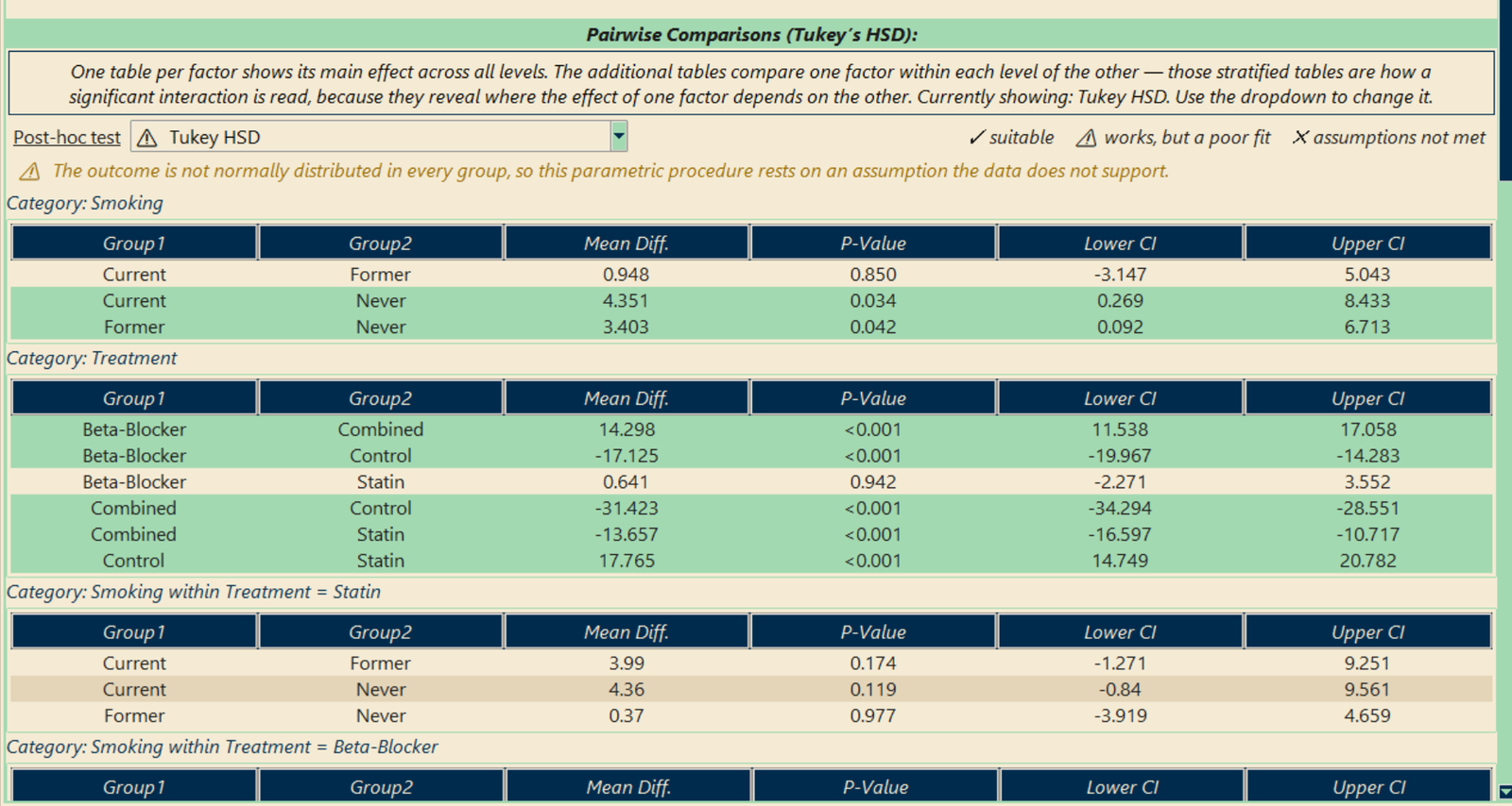
The right pairwise test, marked for your data
Every result with a pairwise table has a dropdown of the procedures valid for that design — 31 in total, from Tukey HSD and Games-Howell to Dunn, Nemenyi, DSCF and Dunnett. Each one is marked by how well it suits the data in front of you.
- ✓ green, ⚠ yellow, ✗ red — a red procedure will not run by accident; a dialog explains why
- Switching recomputes the table in place; row order stays the same, so p-values compare directly
- Your choice becomes the default for that test, is saved in the project and used by the Word export
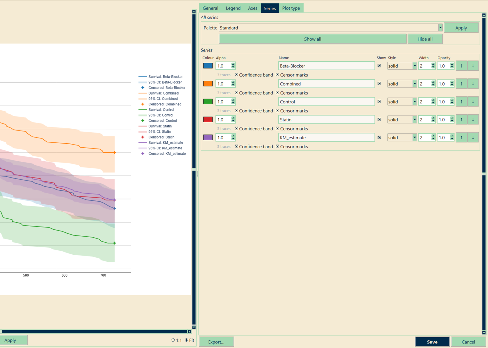
A figure editor that knows what a figure contains
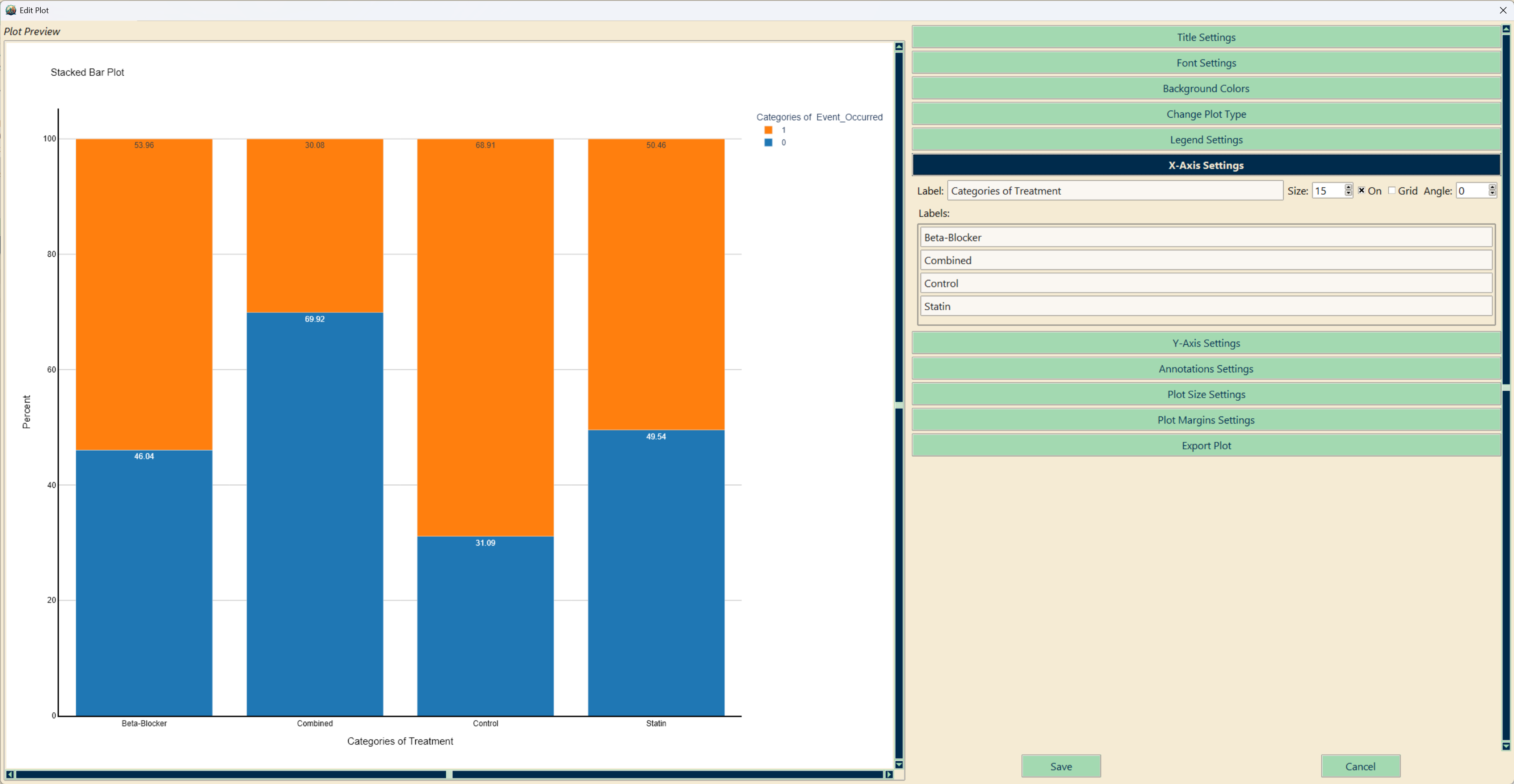
The editor reads the figure, not the test name: a survival plot gets one row per arm with its confidence band and censor marks as toggles, a heatmap gets a colour-scale tab, a combined figure a panels tab. Only the controls that apply are shown.
- Live preview, undo/redo, journal single- and double-column size presets
- Publication (colour / greyscale) and Presentation styles in one click — greyscale varies dashes, symbols and hatching, not just shades
- Switch any result to another compatible chart type without re-running the test
- Export as PDF, SVG, PNG, JPEG or WEBP at 1–8× scale
See StatInsight in action
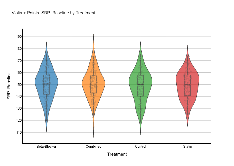
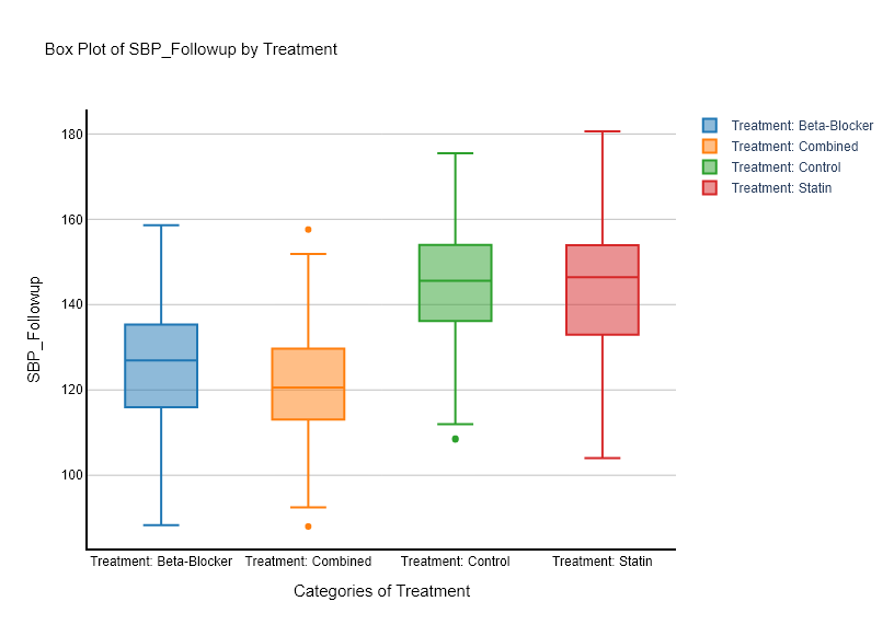
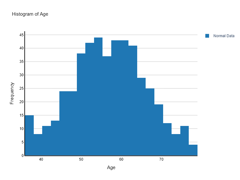
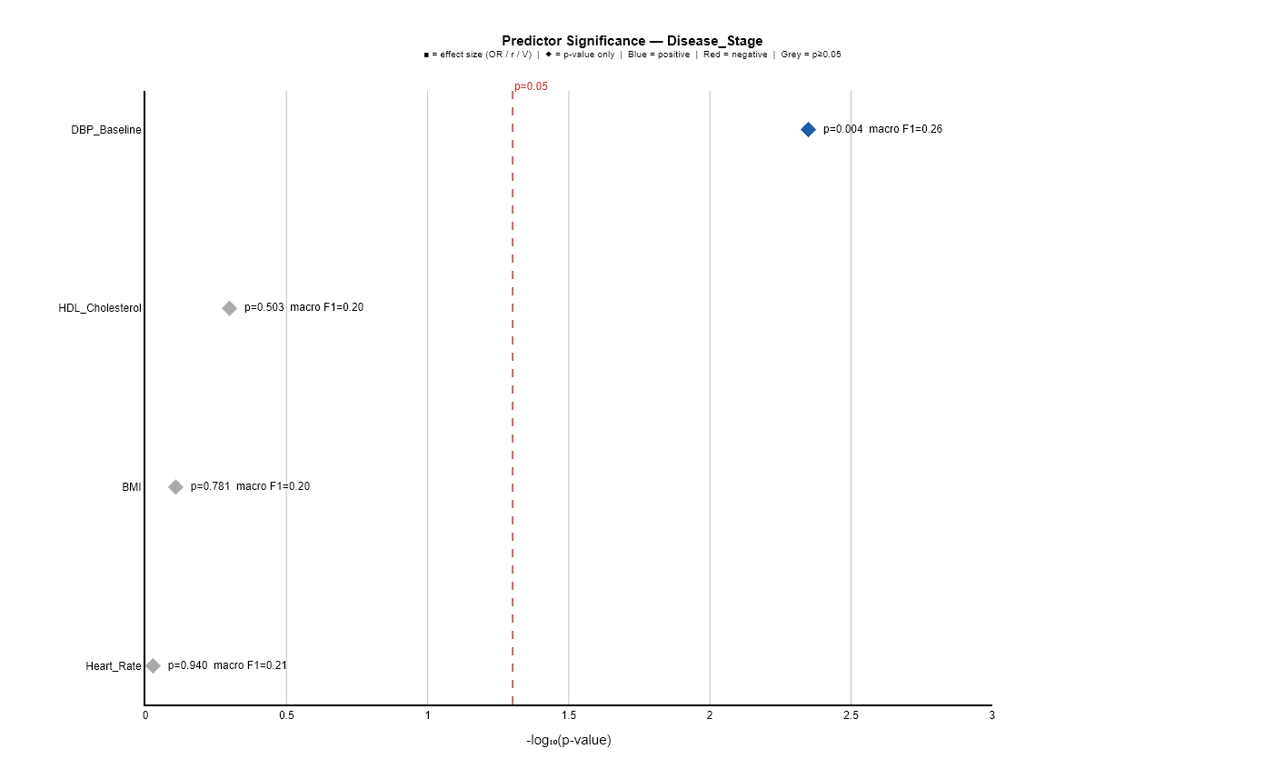
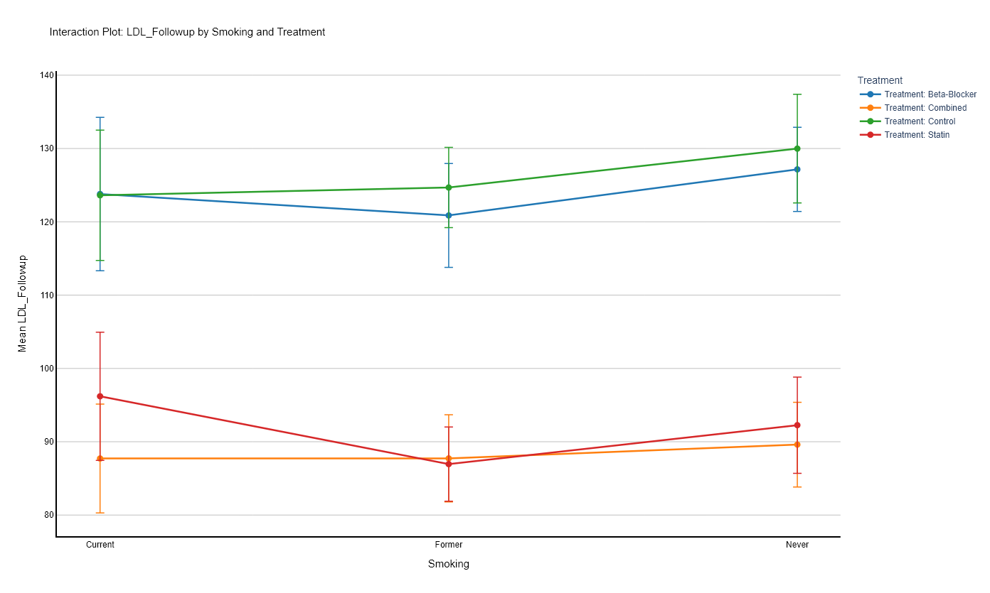
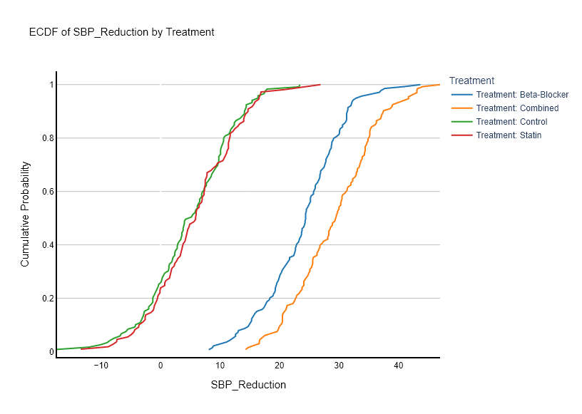
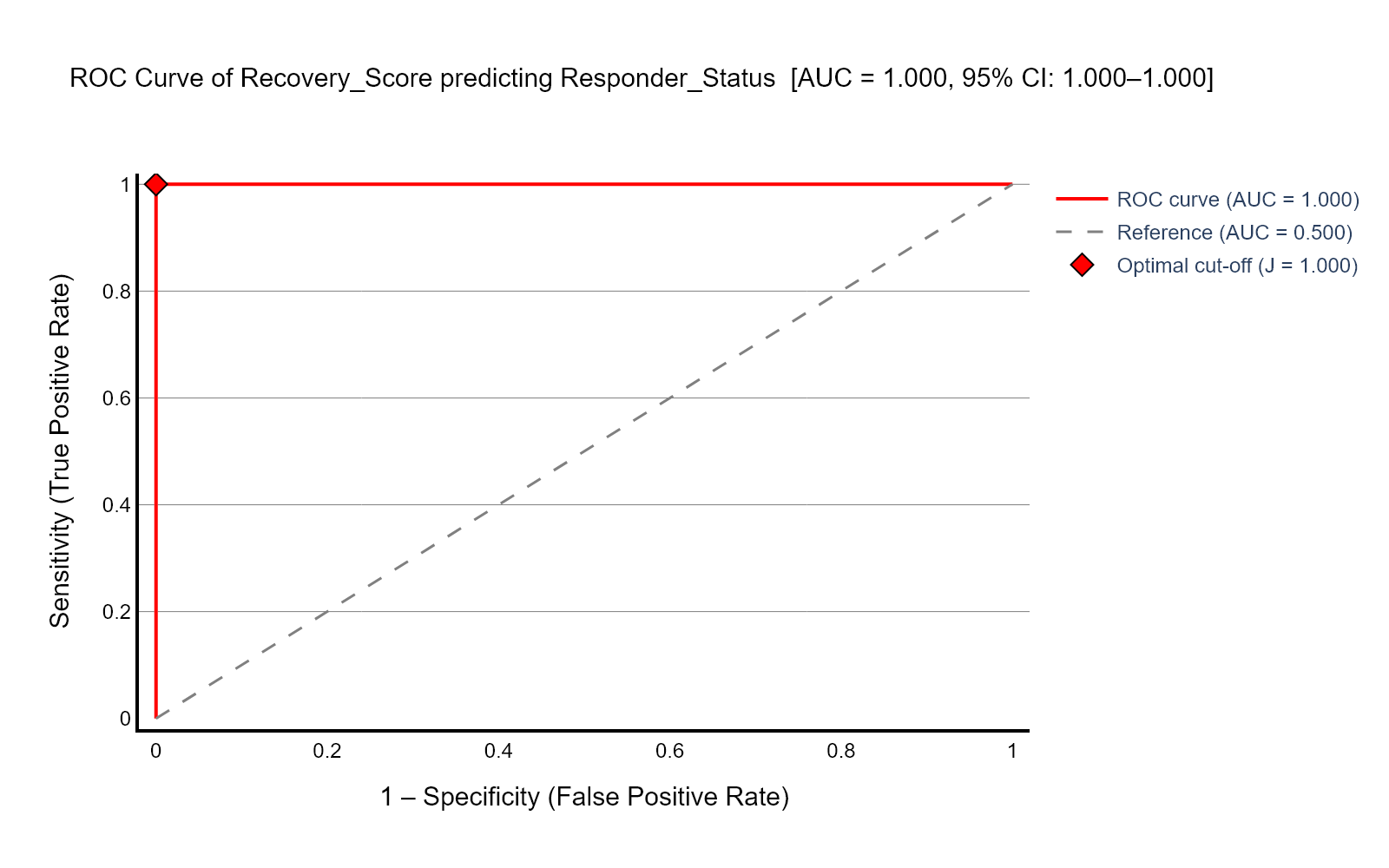
Publication-ready charts, automatically
Every statistical test generates the right visualisation, switchable to any compatible alternative — and finished figures can be combined into one. Hover to pause.
Simple, transparent pricing
Start free for 14 days — no credit card. Upgrade when you’re ready.
- All 30 statistical tests
- Post-hoc & multiple-comparison correction
- Plot combiner & editor
- AutoPrediction
- Word export
- Fully offline
- All 30 statistical tests
- Post-hoc & multiple-comparison correction
- Plot combiner & editor
- AutoPrediction
- Word export
- Fully offline
- All 30 statistical tests
- Post-hoc & multiple-comparison correction
- Plot combiner & editor
- AutoPrediction
- Word export
- Fully offline
- All Annual features
- Multi-device licensing
- Lab & department rollout
- Priority support