When do customers leave — and why?
Survival analysis was built for exactly this question, and it is not a medical tool. Time to cancellation by plan, the odds ratios behind churn, and which channel brings customers who stay.
Fictional data. The dataset on this page is synthetic — generated to show what the app does. It describes no real study, customers, patients or people, and the results are not findings.
The same three questions, answered in the app
Every panel below is a real result from StatInsight on the demo dataset — the text, the numbers, the chart and the report paragraph exactly as they appear on screen and in the Word export. The data behind them are fictional.
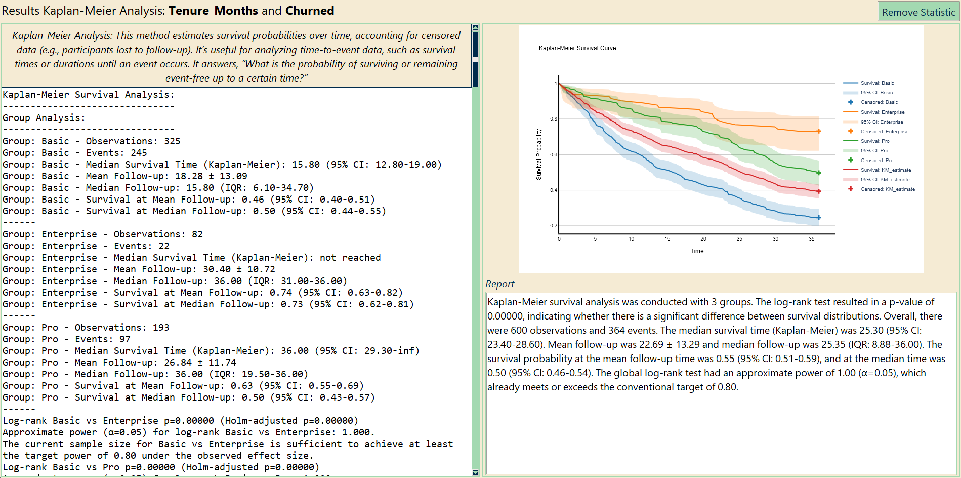
How long do customers on each plan stay?
Time observed, the churn flag and the plan — three boxes. The curves show the share of customers still subscribed month by month, with confidence bands; the text gives the median tenure per plan and the log-rank tests between plans, Holm-adjusted.
- Median tenure: Basic 15.8 months, Pro 36, Enterprise not reached within 36 months
- Log-rank p < 0.001 for every pair of plans
- Customers still active are censored correctly — no need to drop them
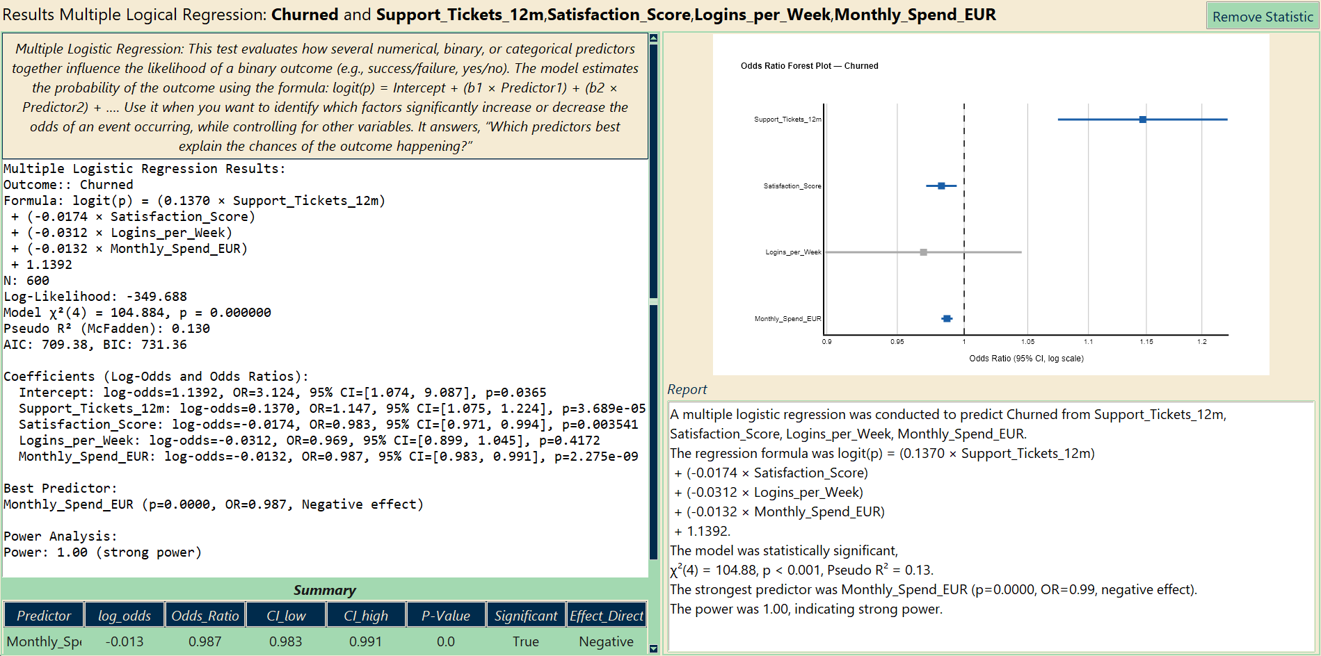
Which behaviours predict cancellation?
Churned on support tickets, satisfaction, logins and spend. The odds ratios with their 95 % intervals are drawn as a forest plot — the figure that goes into the management deck — and the coefficients, McFadden R² and AIC are in the text.
- Each support ticket raises the odds of churn by 15 % (OR 1.15, p < 0.001)
- Each satisfaction point lowers them by 1.7 %; higher spend, lower churn
- Logins per week: no independent effect once the others are in the model
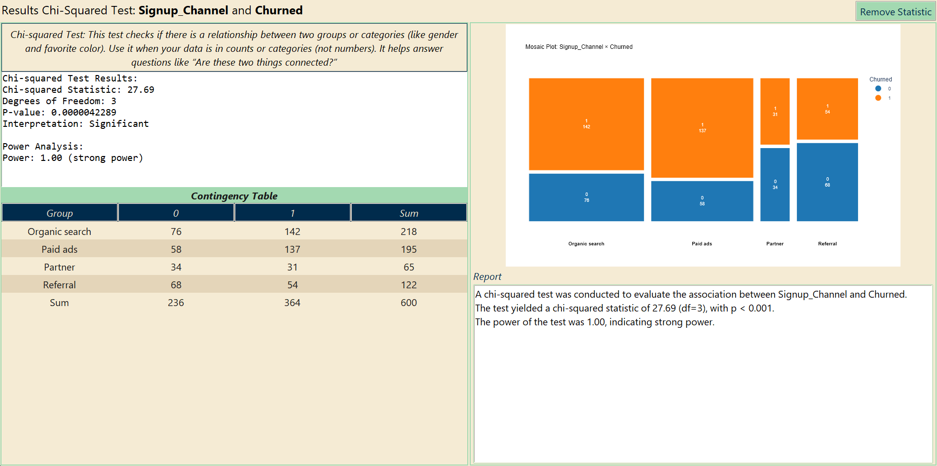
Does the acquisition channel matter?
Two categorical columns: channel and churn. The contingency table, the chi-square statistic and a mosaic plot whose tile widths are the channel sizes and tile heights the churn shares.
- χ²(3) = 27.7, p < 0.001
- Paid ads 70 % churned, referrals 44 %
- Switch the figure to a stacked bar or a contingency heatmap in one click
Subscription customers
600 customers · 11 variables · fictional, computer-generated for this page · free to use in teaching and testing
A 36-month window of a subscription product: plan, acquisition channel, region, spend, support tickets, usage, a satisfaction score, and for every customer the months observed and whether they cancelled.
| Column | Type | Meaning |
|---|---|---|
Tenure_Months, Churned | continuous + binary | Time observed and the event (1 = cancelled) — the Kaplan-Meier pair |
Plan | categorical | Basic, Pro, Enterprise |
Signup_Channel | categorical | Paid ads, Organic search, Referral, Partner |
Support_Tickets_12m, Logins_per_Week | continuous | Usage and friction |
Satisfaction_Score | continuous | 0–100 |
Monthly_Spend_EUR, Discount_Applied, Region | mixed | Commercial attributes |
Reminder: every number, table and chart on this page comes from a fictional, computer-generated dataset. They demonstrate the tool, not a real result.
Also in this dataset
- Ask AutoPrediction which of the eleven columns matters most for churn
- Spend by plan and region: two-way ANOVA
- ROC curve: how well does the satisfaction score alone predict churn, and where is the cut-off?
- Combine the survival curve and the forest plot into one figure with the Plot Combiner
Other fields: PsychologyEducationMarketingAgriculture & biologyHR & people analytics